Case Study
Incite Magazine
Reviving a creative community on campus
AWARDS:
WINNER, EMERGE MEDIA AWARDS (2017)
Brief:
rebrand mcmaster university's creative publication to bring together its arts community
Creative Direction
Branding
print DesigN
editorial leadership
Community Engagement
art director: lauren gorfinkel
co-editor-in-chief (content): Sunny yun
Incite Magazine is McMaster University's creative arts and writing publication. It was originally a clean and slick publication—glossy with an intensive usage of the Helvetica family throughout. At first glance, its flat, modern and minimal visual style did well with riding the wave of current design trends.
However, there were several factors restricting its readership and potential:
Its rigid visual style was highly digital, despite it being a physical publication
Articles and artwork were crammed together with little negative space, making it hard for sustained reading
Its glossy pages & thin publications (about 30-40 pages) made it seem temporary and disposable
Almost all stages of production were done over the Internet
There was a lack of human connection with the brand
As Editor-in-Chief of the 19th volume of Incite, I spearheaded a rebranding strategy to breathe life into the publication and arts culture on campus:
Redesign Incite's old sans-serif logo
Establish new creative direction—including typefaces, layout styles, paper quality and binding style
Implement various Community Engagement strategies on campus—working with our first Event Planners and Promotions Coordinator
Orient the publication as "human-first"—from its layout production process to its distribution events
Cultural Insights
cynicism for the arts on campus
“You’re going to be flipping burgers!” “You'll be making $10.25!” (The minimum wage at the time.) I realized quickly that these words and numbers were carefully crafted expressions of a mindset towards arts students on campus.
McMaster University is a school known primarily for its STEM [science, technology, engineering, math] programs. There was a cynicism for arts through the constant lack of representation, opportunities and a public sphere that encouraged democratic, creative expression. I recognized that the creative arts are not just a product—but an avenue that allows for the bridging of social relationships in working towards the shared goal of creative expression.
I have always believed in the power of Incite to become a valuable public space for creative and artistic expression in a campus defined by the hard sciences. Moreover, I saw in Incite a platform that was able to expose and connect different worldviews—and ultimately create a democratic sphere for meaningful discourse on campus.

A New Visual Style
Communicating authenticity and honesty through design
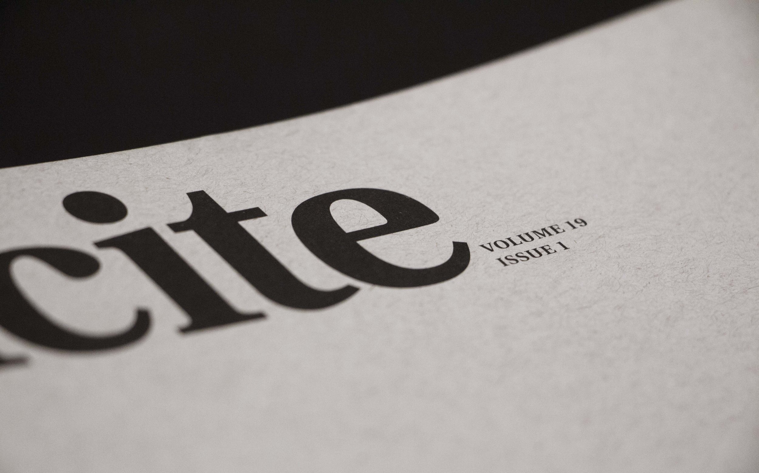
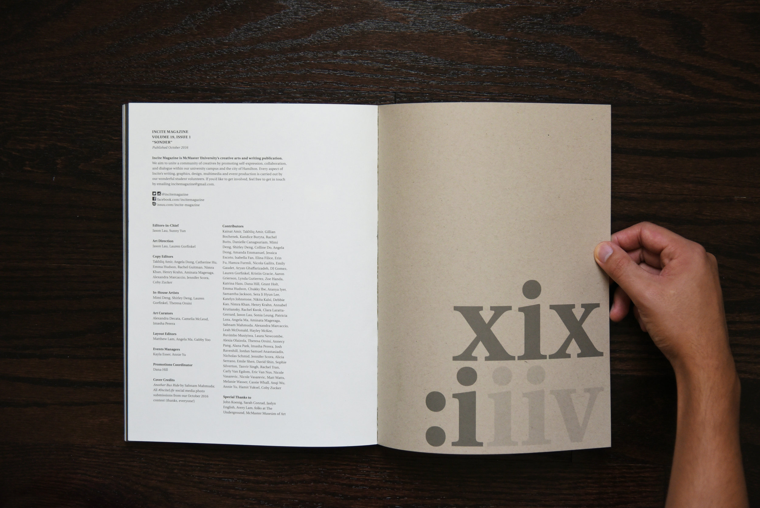
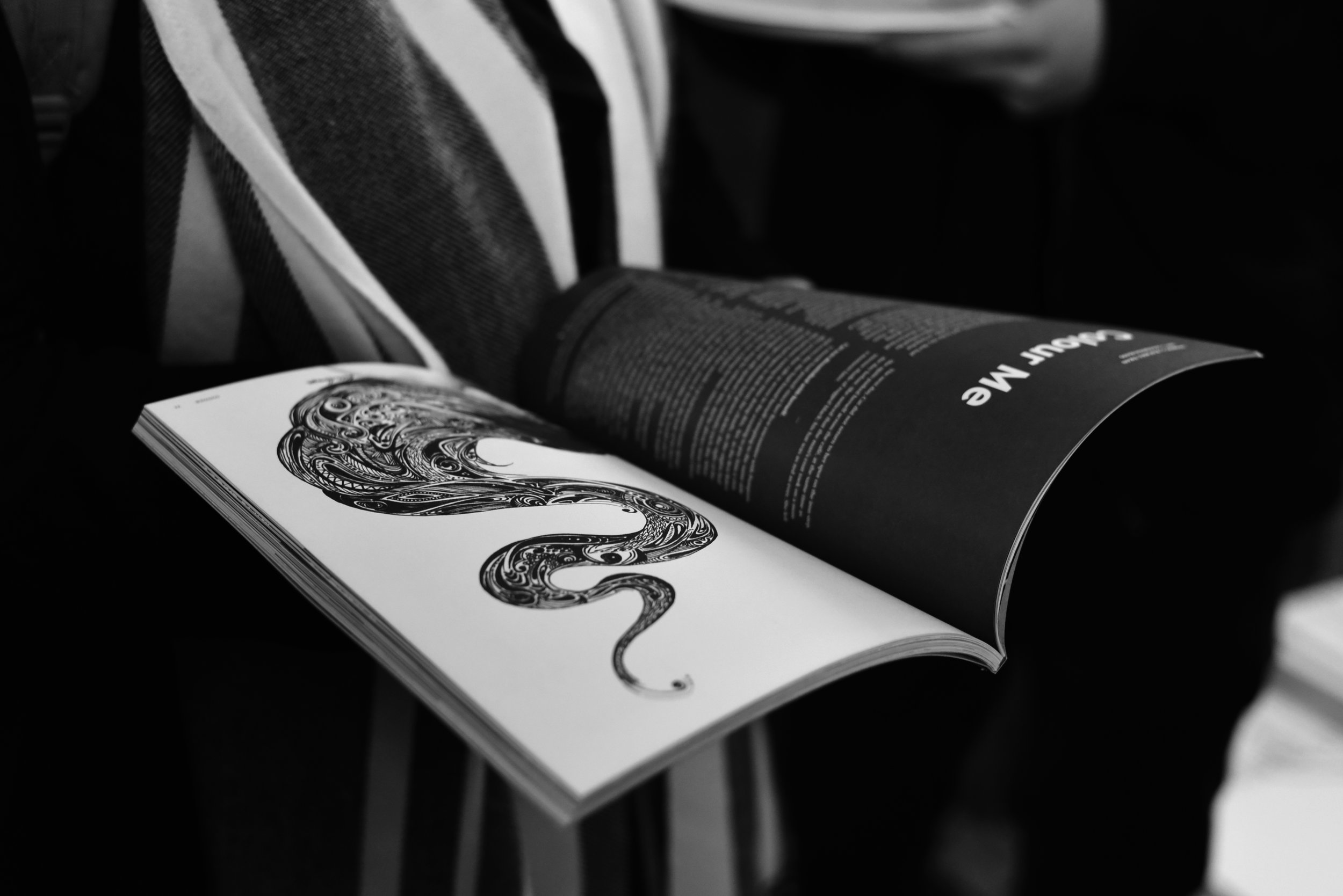
The most important redesign was of the logo itself. We removed the "Magazine" from the previous logo to make "Incite" an organization that was larger than a regular publication—it would be a community, rather than the name of a magazine. The end result is a bold emblem that stands strongly on its own and is highly recognizable on each cover. Switching over from a sans-serif heavy visual style to re-introducing serifs was important not only for ease of reading, but also to communicate a sense of tradition and authenticity.
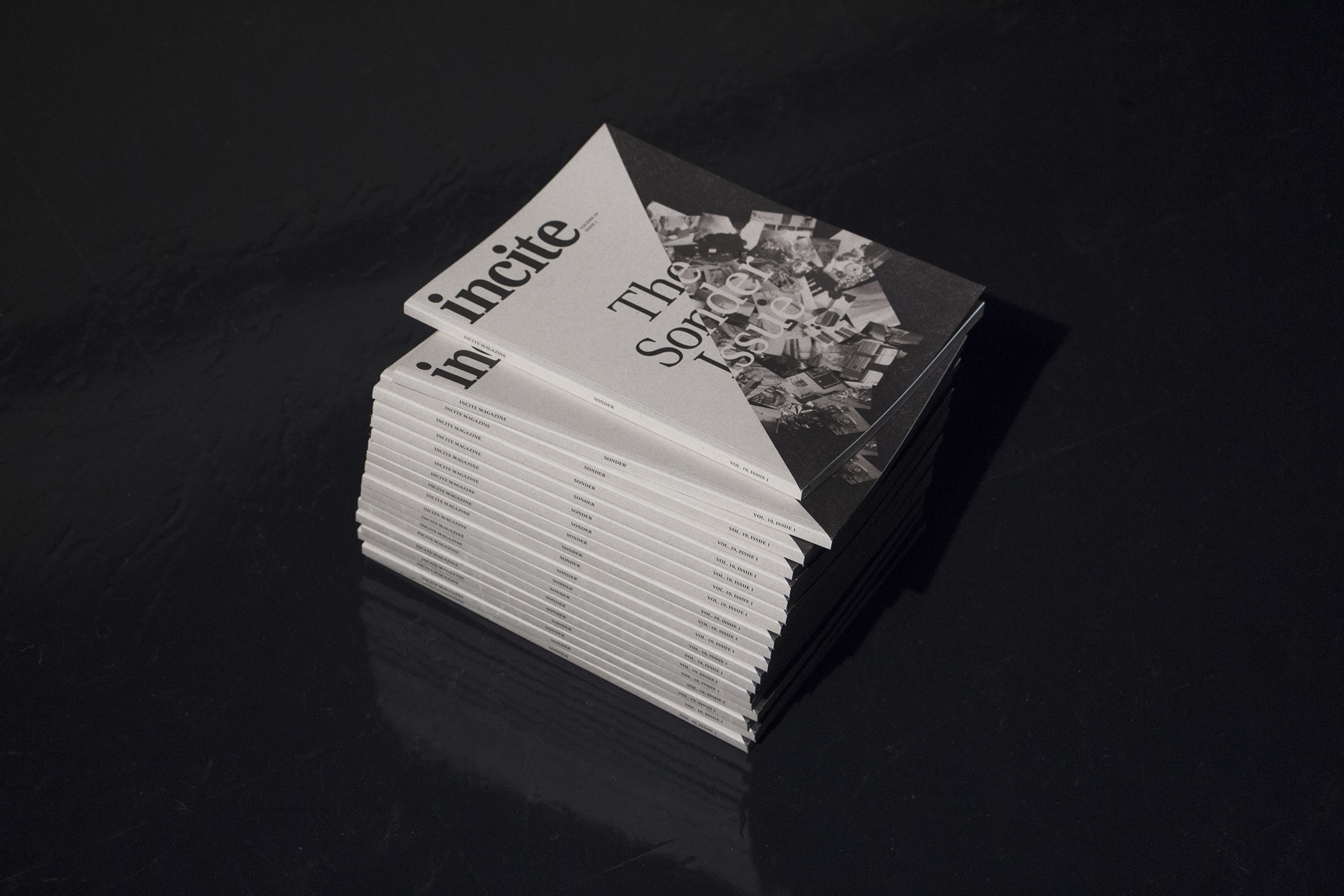
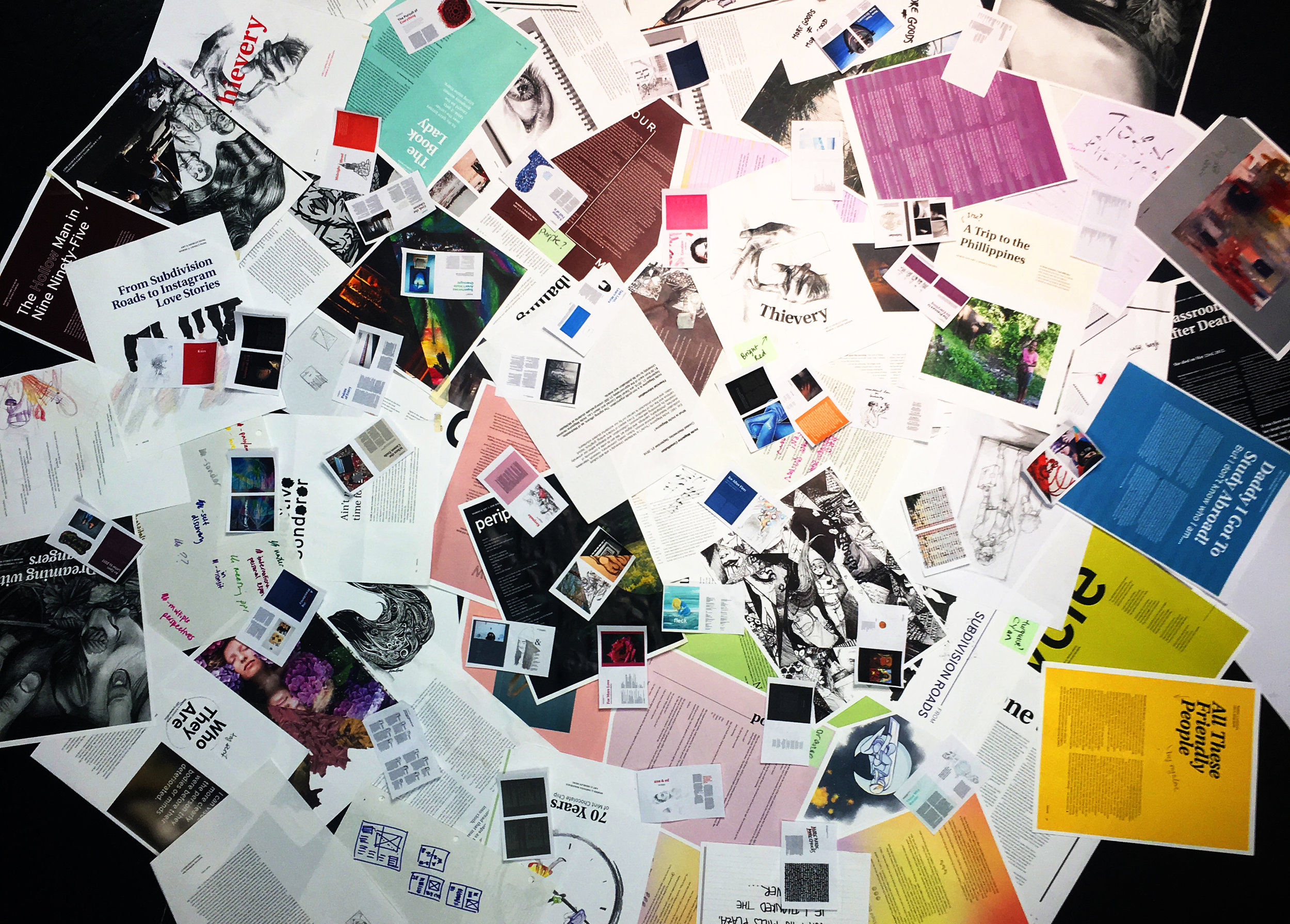
We decided also to change the regular publication from a small monthly one to a larger (80+ page) bi-monthly issue, to focus on quality over quantity. A new 80gsm recycled cover stock was used along with off-white 60gsm inner pages for a tactile, vintage feel. We also switched from saddle-stitching to perfect binding. The result was a magazine resembling more of a book than a magazine, which encouraged readers to spend more time reading and exploring its pages and ultimately keep the publication—rather than dispose of it shortly after distribution.
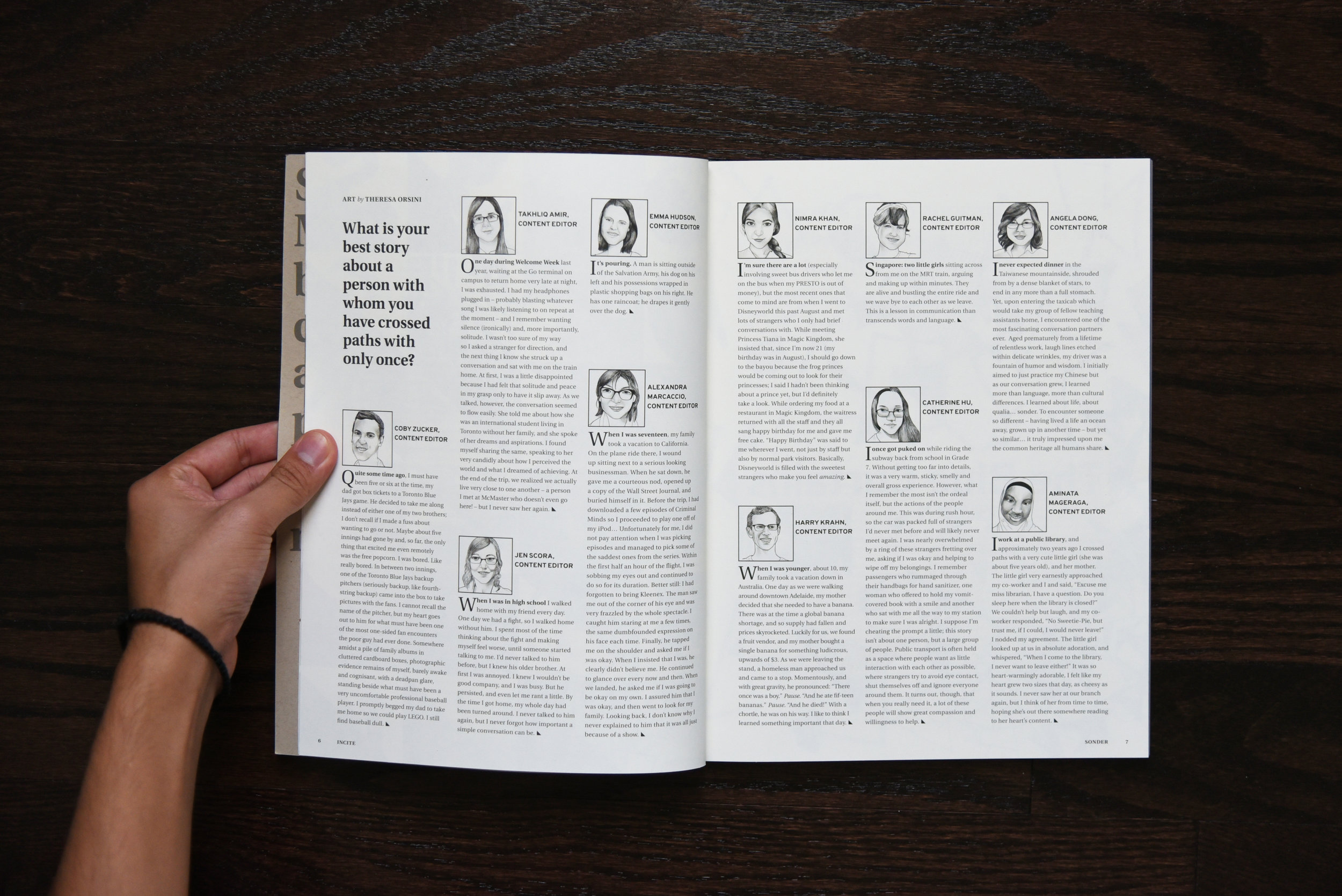
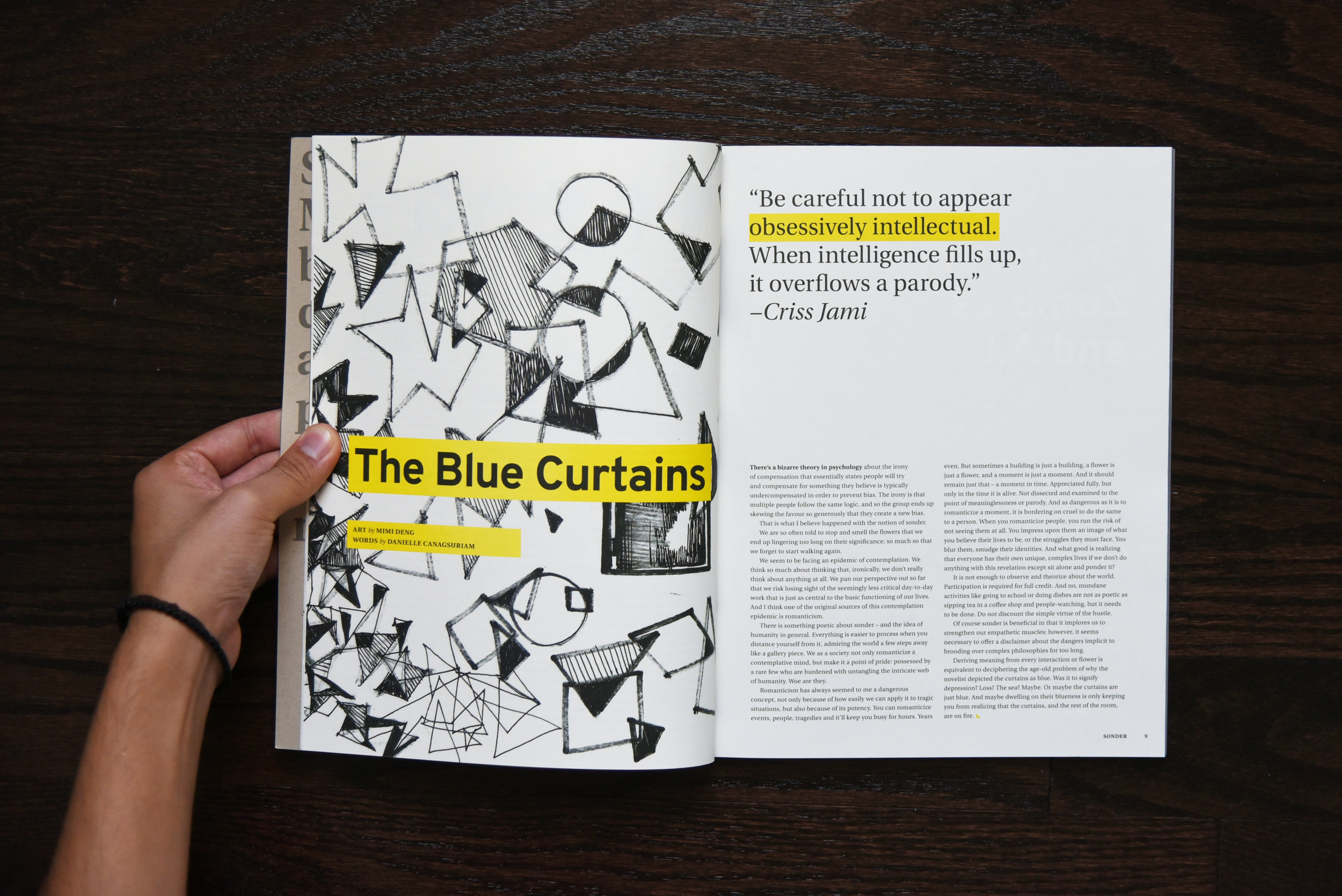
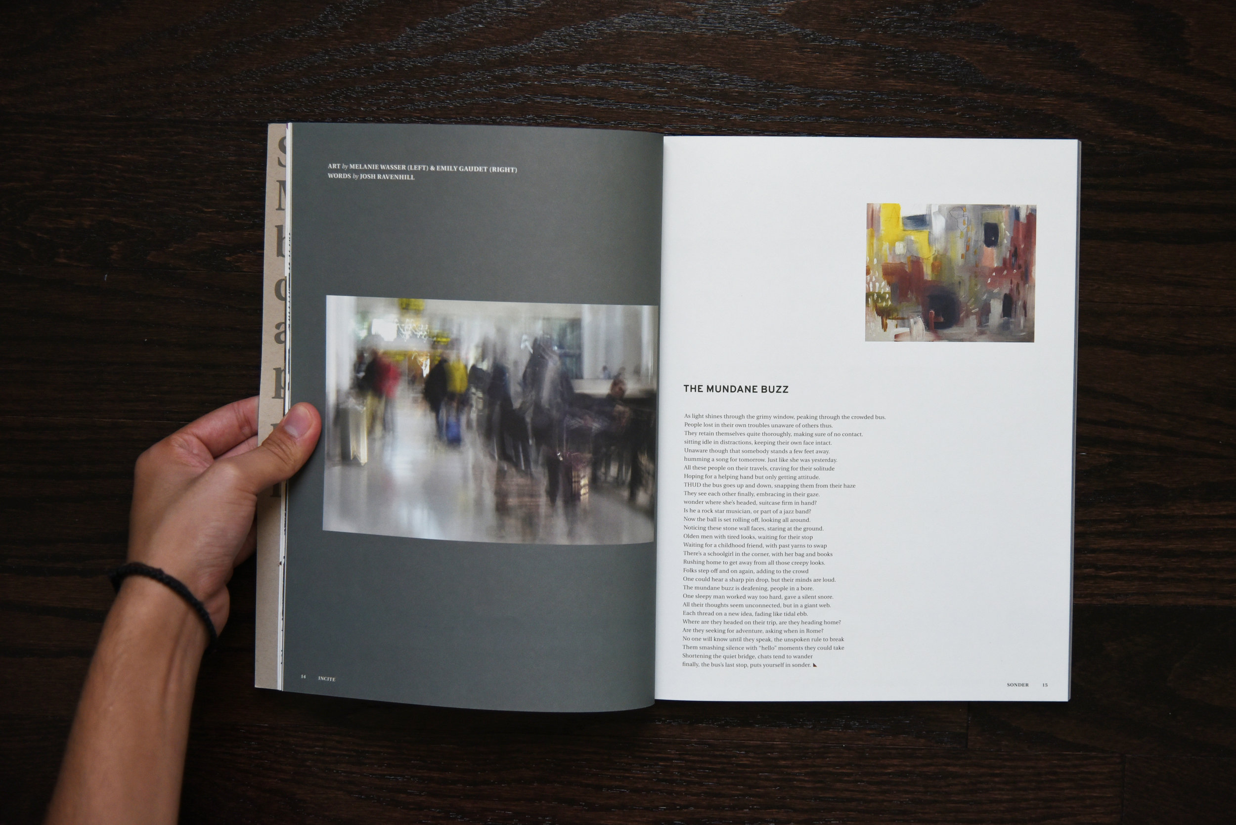
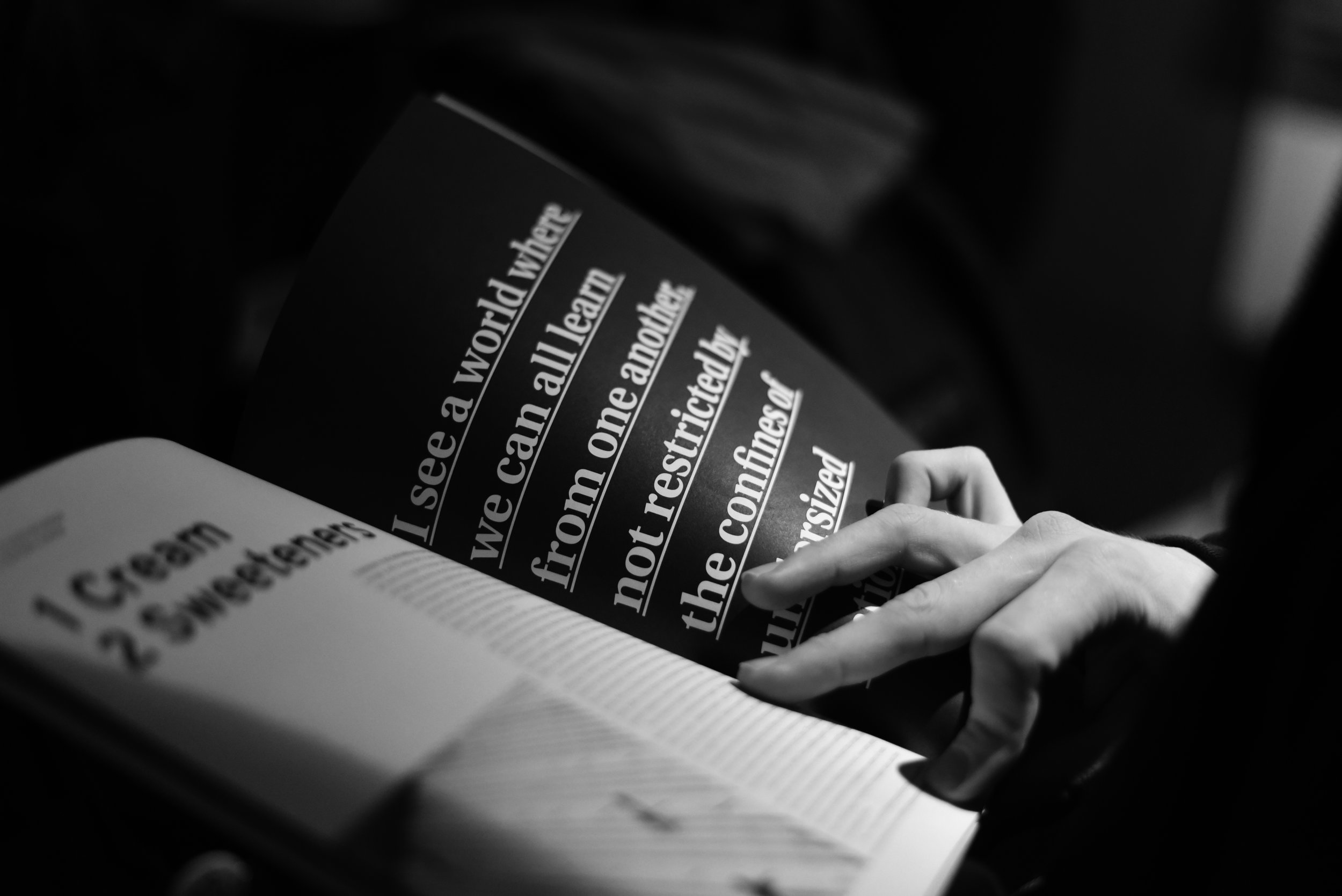
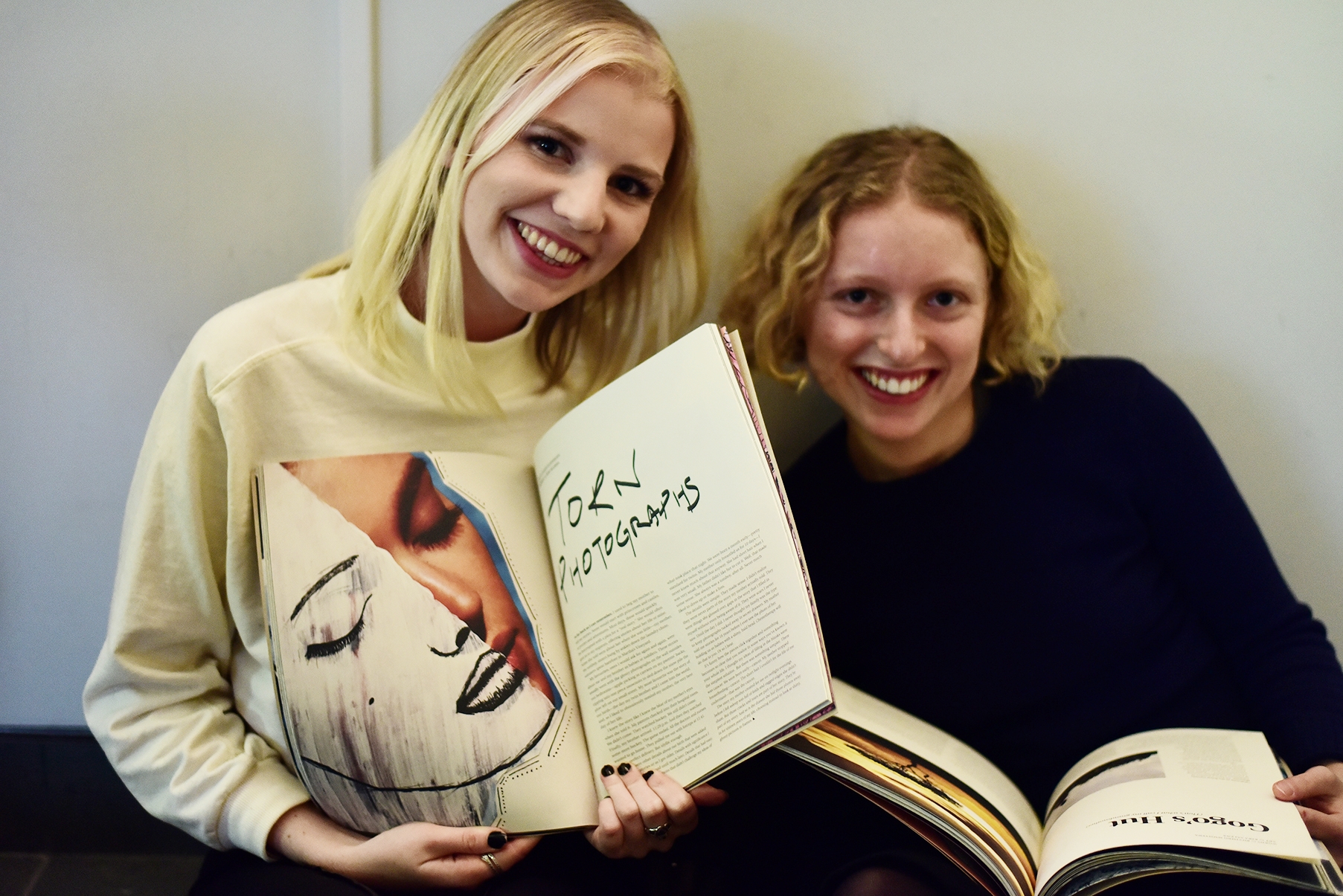
In an effort to move away from a highly digital visual style, I worked along with an Art Director to ensure we featured different types of fine art, specifically focusing on illustrations and hand-drawn pieces.

Vol. 19, Issue #2: Imperfection

Vol. 19, Issue #3: More

Vol. 19, Issue #4: Next
Behind the Scenes
A high-quality magazine comes from a collaborative Design team
A community-oriented magazine must come from a genuine internal collaborative culture. After hiring for a small but close team of layout designers, I made a large effort to work closely together, providing necessary and important training needed for every designer. Through the entire production process, from the conceptualizing of designs to its editing (even in reviewing proofs), I made sure that we always collaborated together to bounce ideas and gather synergy from all designers. The end result of cultivating a close-knit design team was in fact a collaborative magazine that was able to speak to its creative audience.

Special thanks to the fantastic design team: Lauren Gorfinkel, Angela Ma, Matthew Lam, Tram Nguyen and Gabby Yoo
The Incite Community
establishing incite as people-first and community-oriented
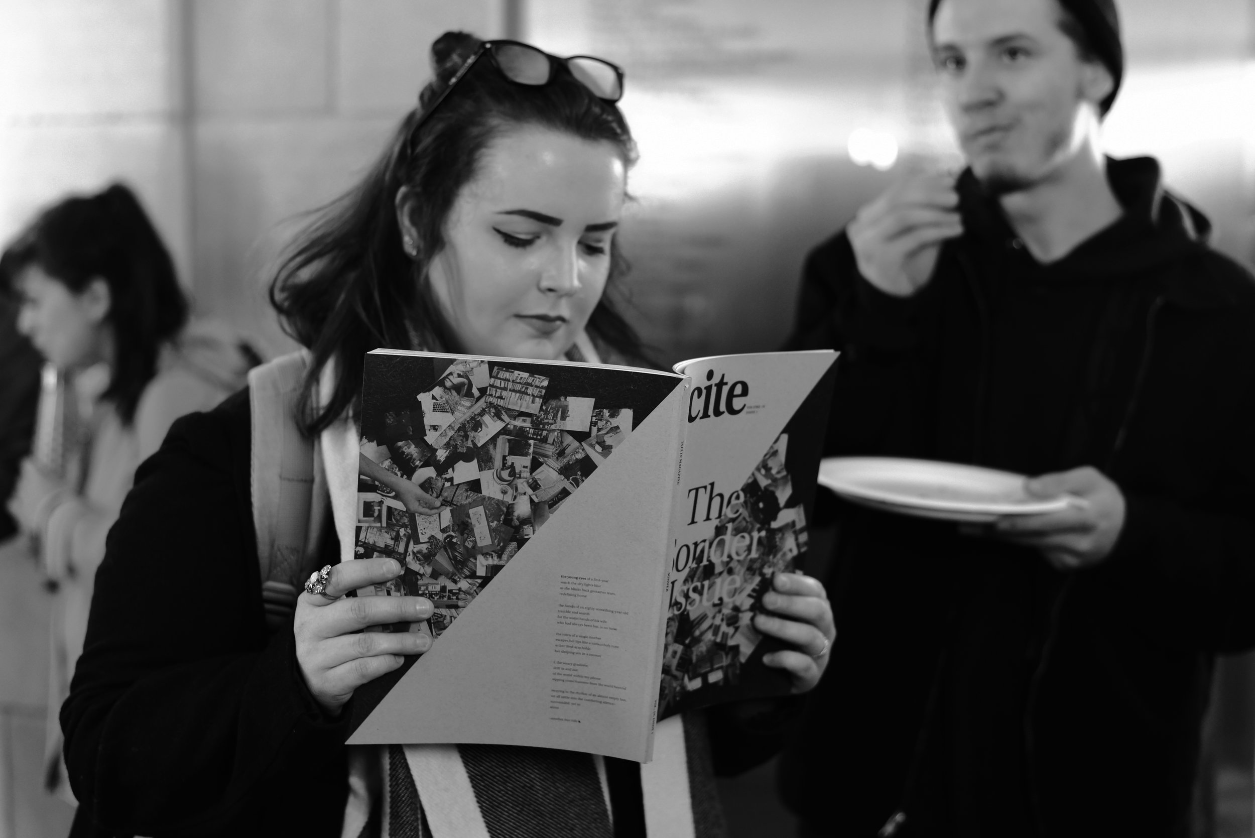
One of the most important steps we took in rebranding Incite was to place a large emphasis on community engagement. We saw the hiring of our first Event Planners as well as Promotions Manager, who helped solidify the logistics of this engagement.
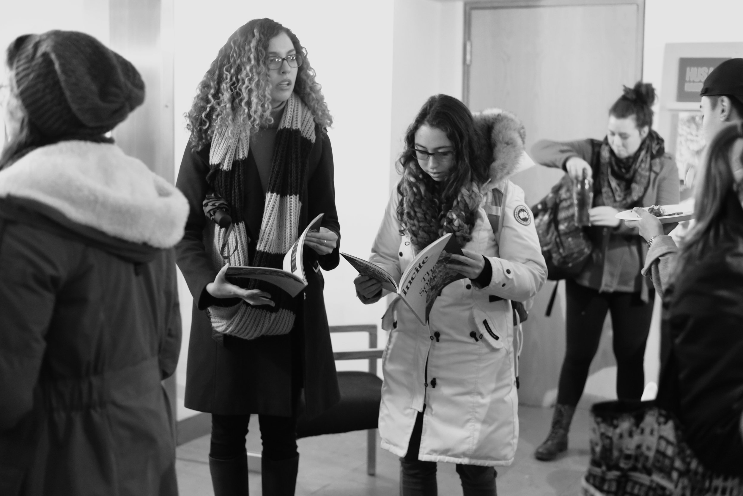
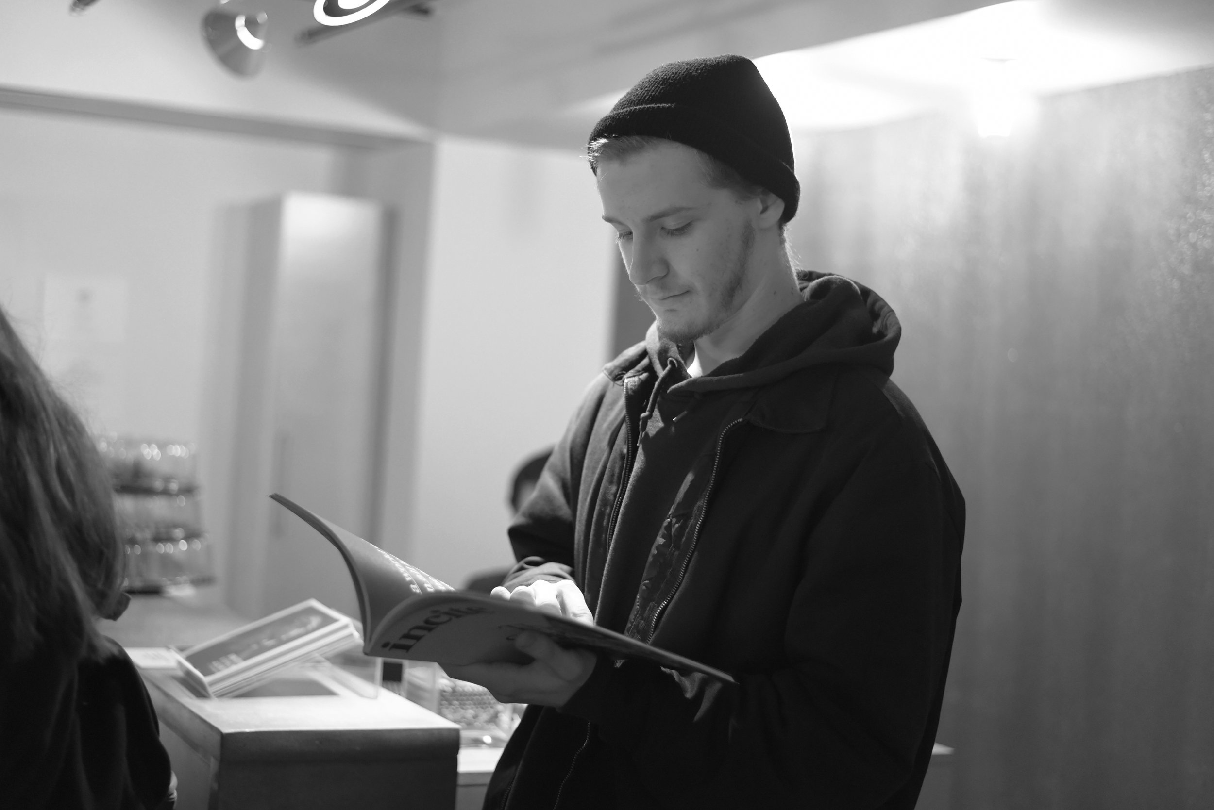
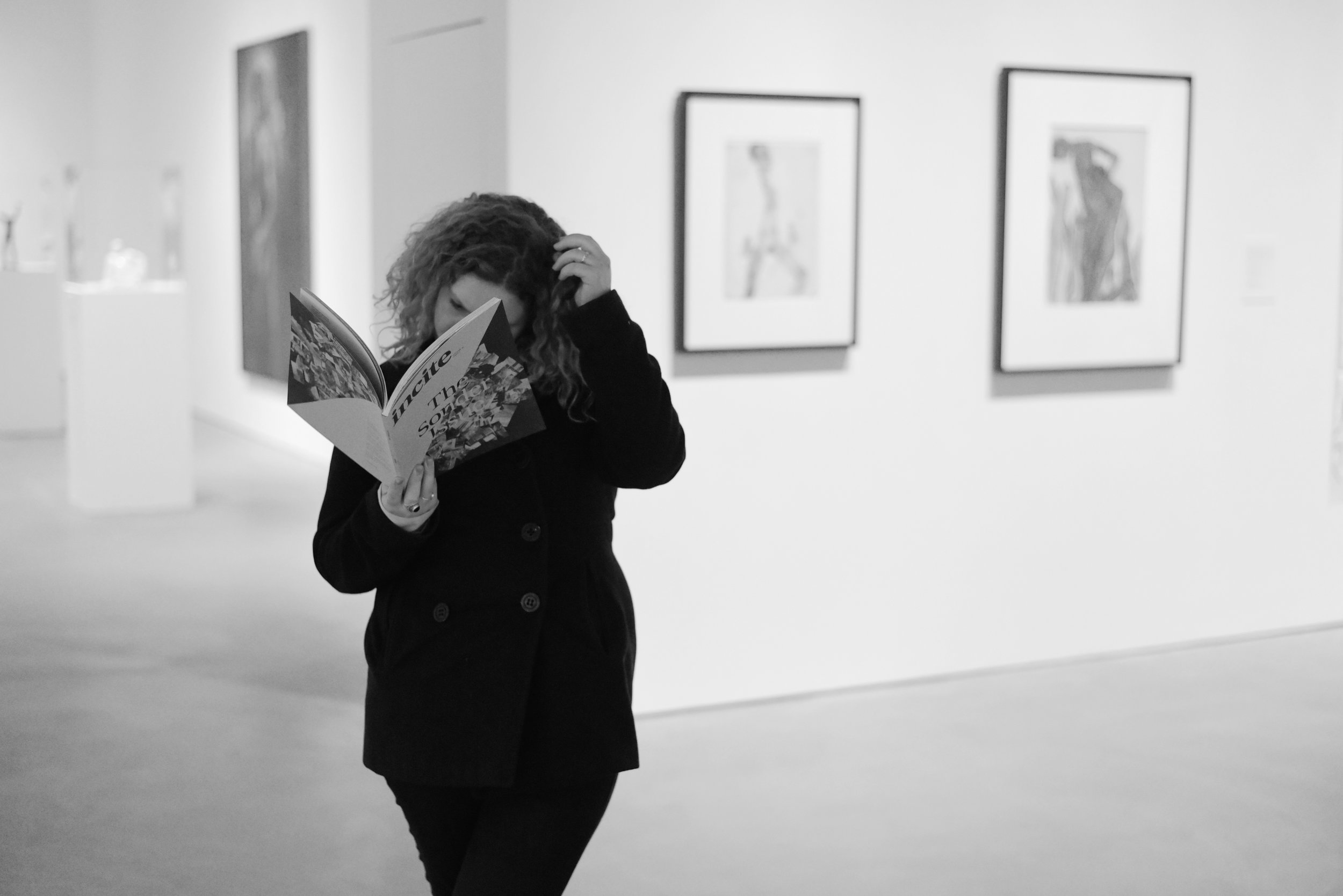
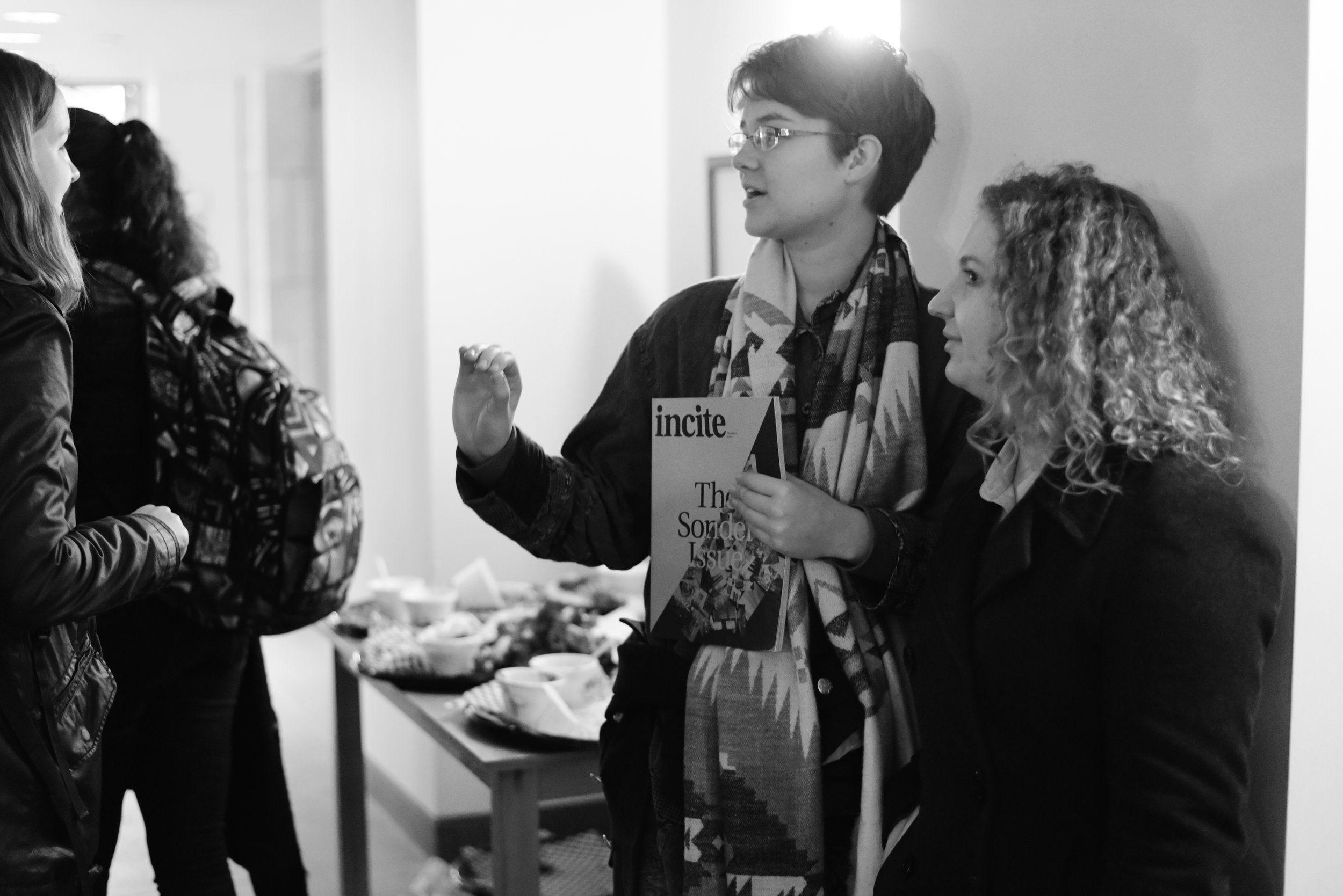
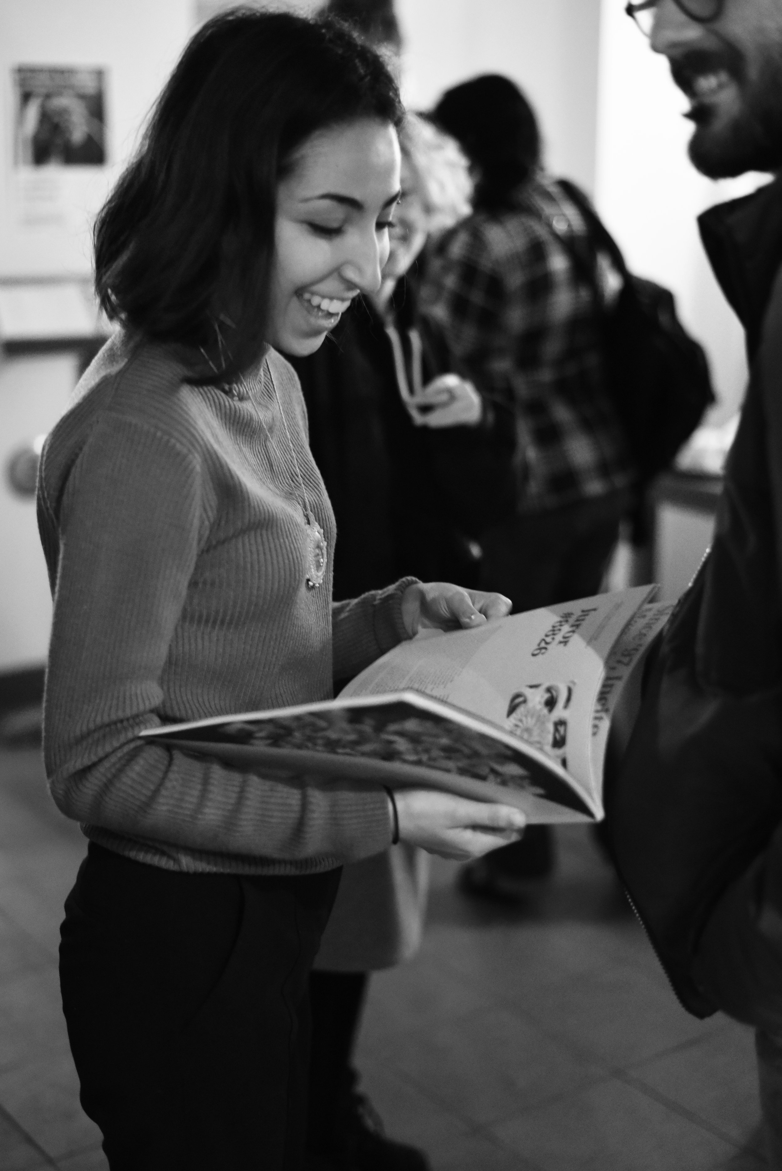
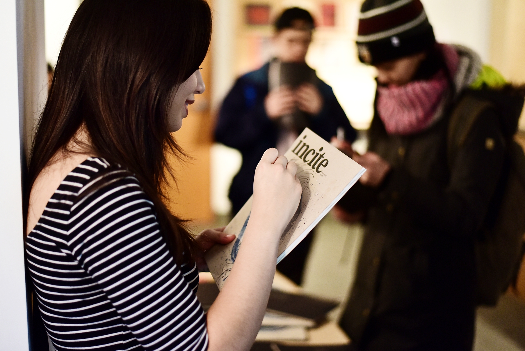
In the past, magazine distribution simply meant dropping copies off on stands across campus. However, we realized that the most important point of contact with our readers was at distribution itself; we had to ensure that every reader physically got their copy from another person. As a result, we collaborated with the McMaster Museum of Art to host social distribution events (with art exhibits, creative activities, food and drink)—to ultimately celebrate creativity on campus together.
Our distribution events saw much success as creatives all across campus were brought together to meet, network, forge new friendships and spark collaborations for the next issue.
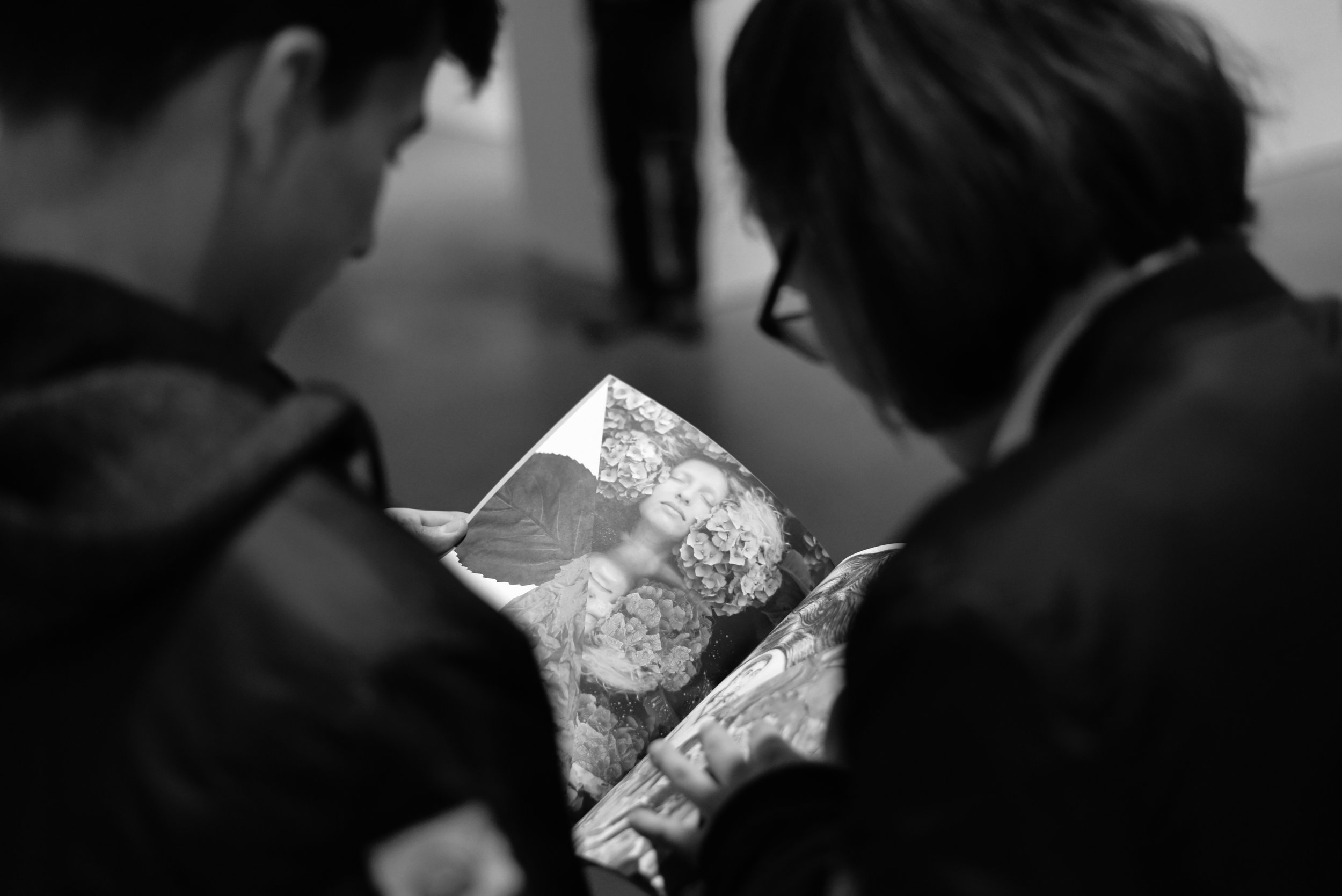
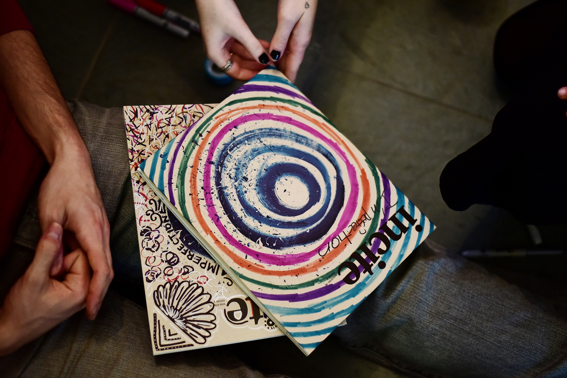
Shown below are photographs from our Imperfection Distribution Event, which featured an interactive activity for readers to personalize their covers by drawing on it and writing the theme "Imperfection"—making their cover imperfect in their own way, but ultimately embracing that beauty.
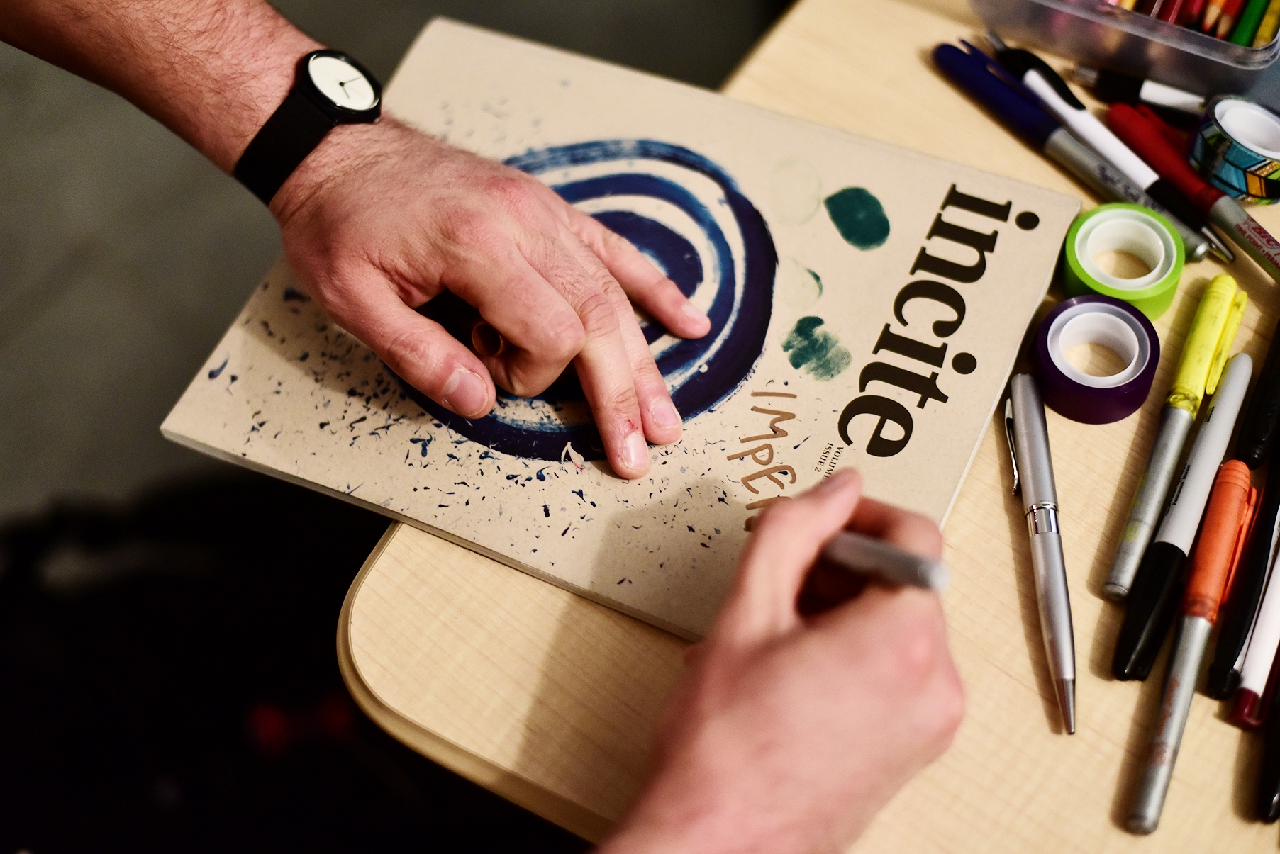
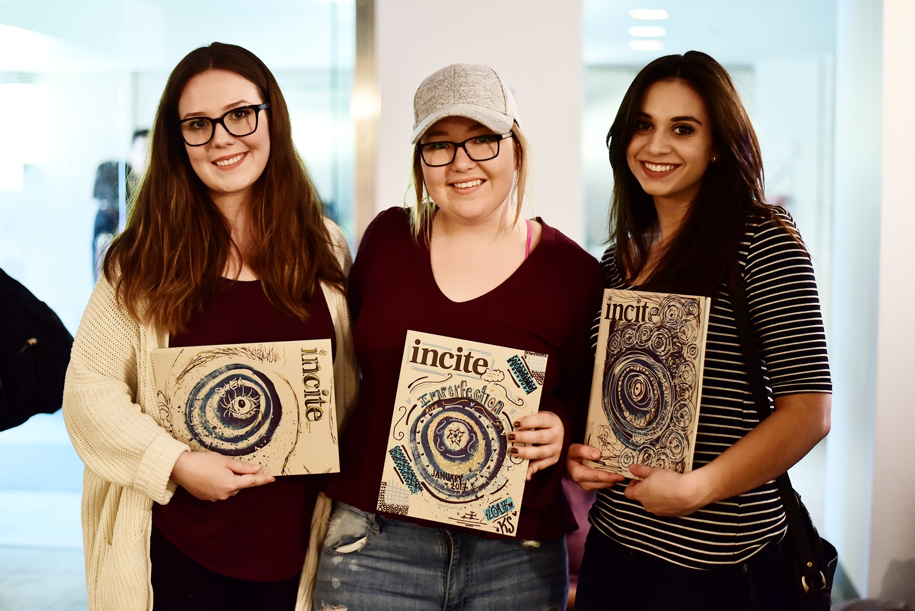
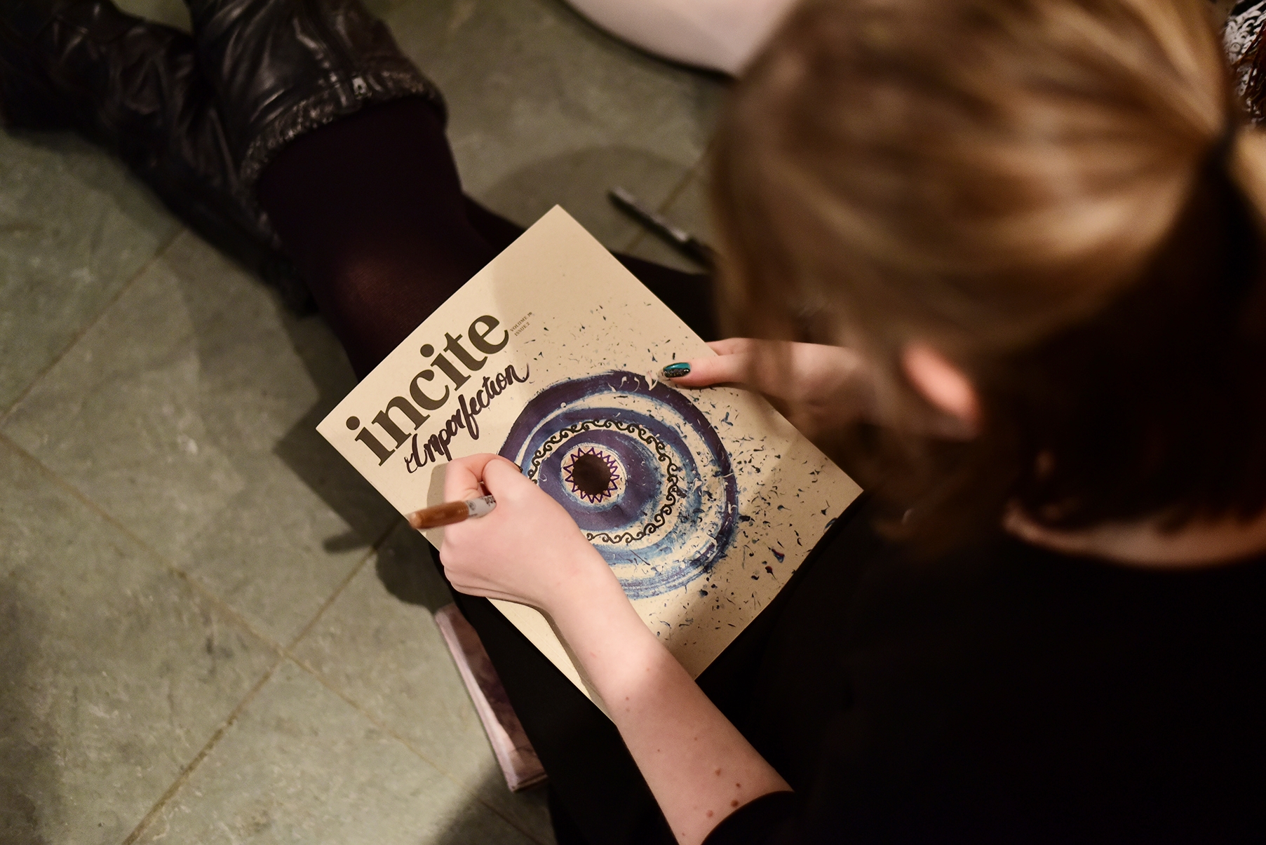
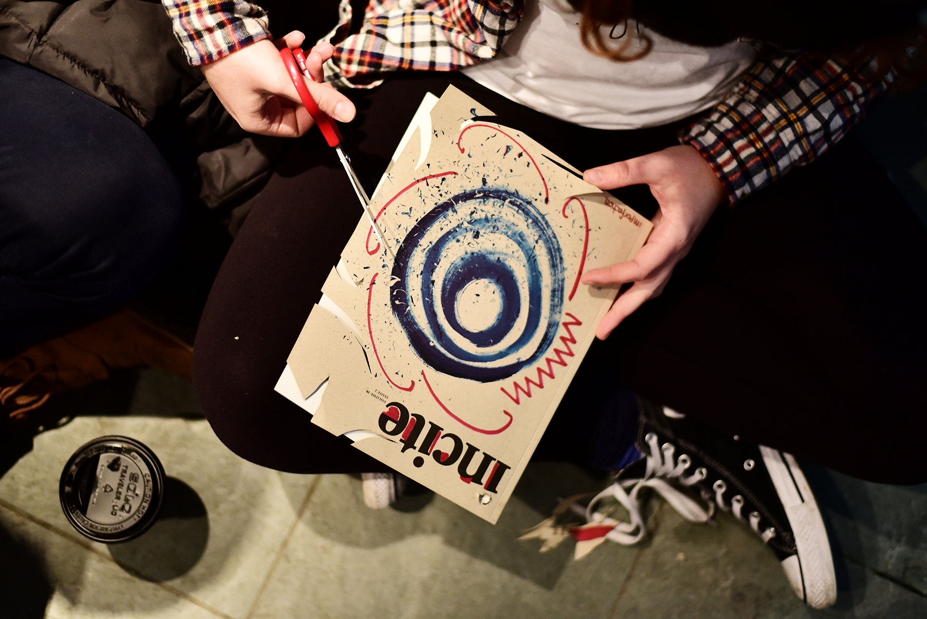
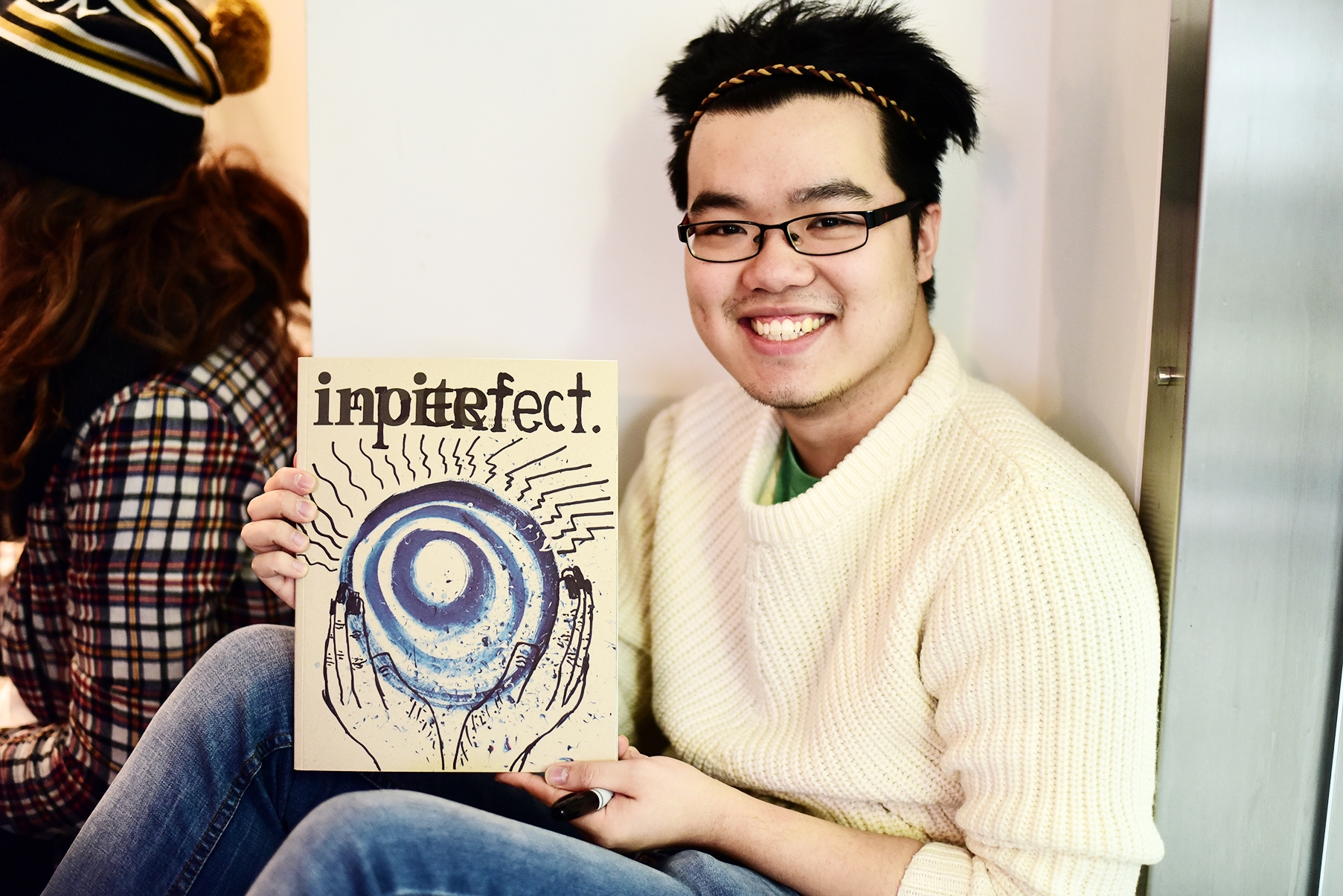
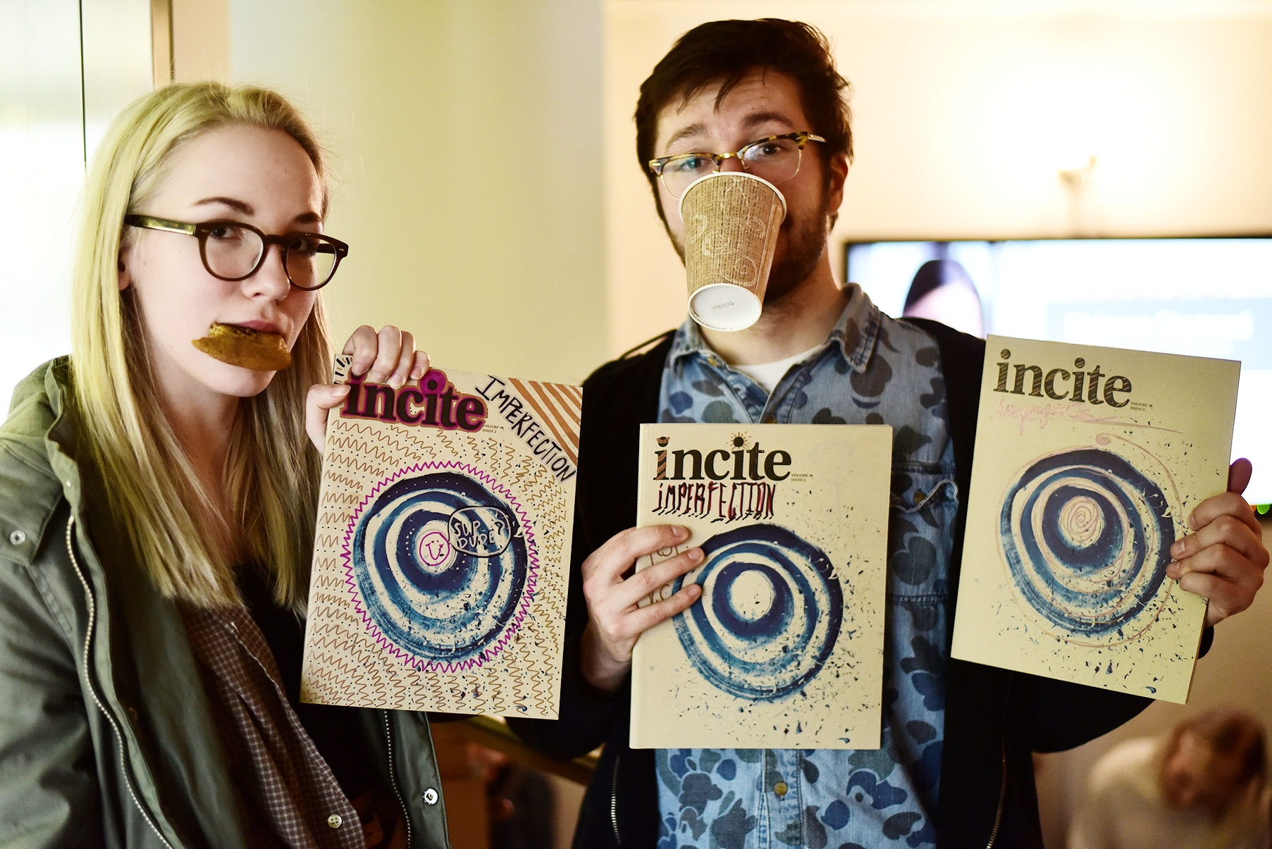
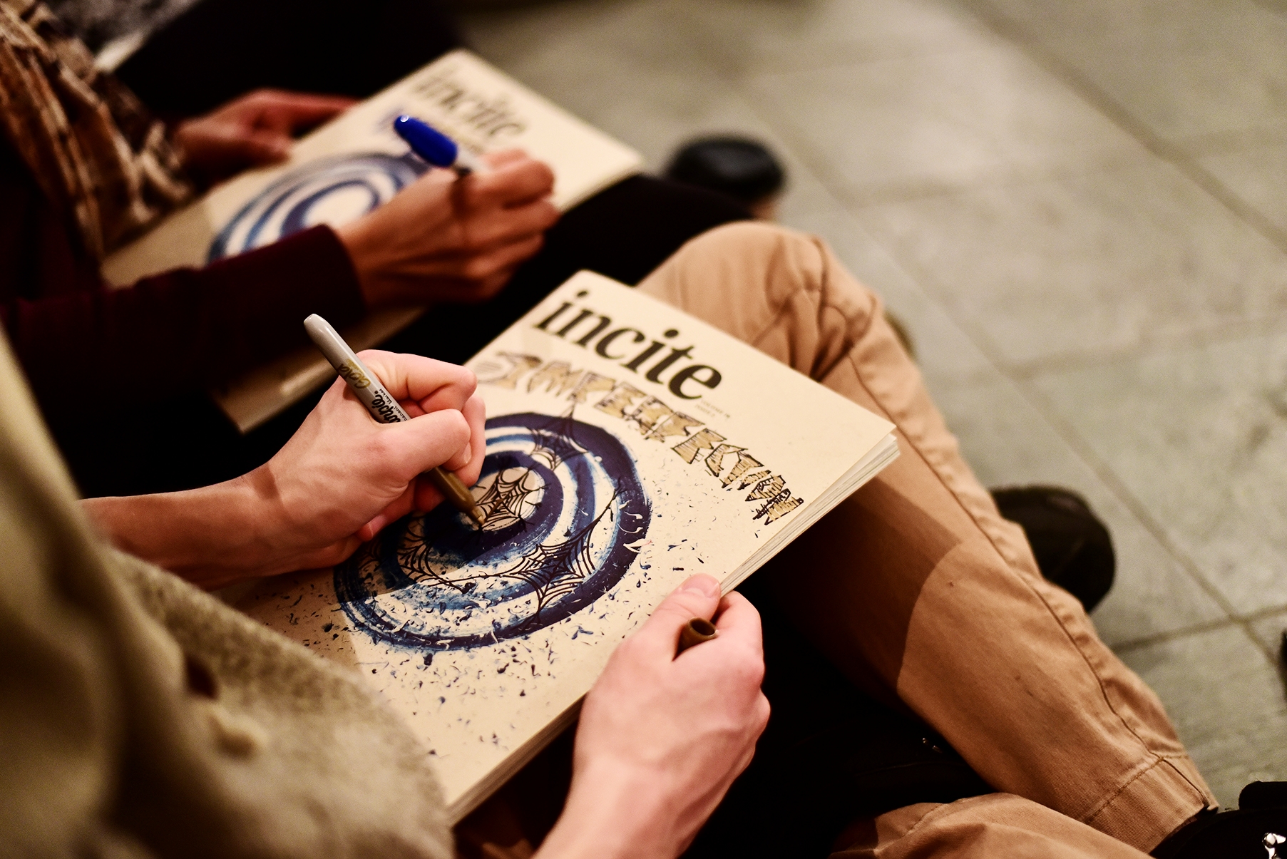
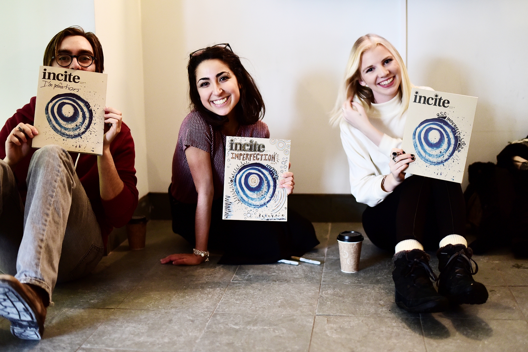
The Imperfection Distribution Event (special thanks to Event Planners Annie Yu and Leah McDonald for making this event a reality)
Rebrand Results
A creative community inspired and brought closer together on campus
An Emerge Media Award
2,400+ copies printed
800+ active readers
100+ active contributors
Diverse editorial team from 12+ academic backgrounds
+14% social media following
+115,693 Facebook impressions
The Incite rebrand has thus completely elevated the image and relevance of creative arts on campus, most notably encouraging students to follow their artistic passions, and helping to tell the marginalized life stories of students through unbounded creative expression.
Throughout my term as Editor-in-Chief I worked with a Promotions Coordinator to ensure that we were constantly growing our audience and online social media following, on top of providing regular content for impressions and engagement.
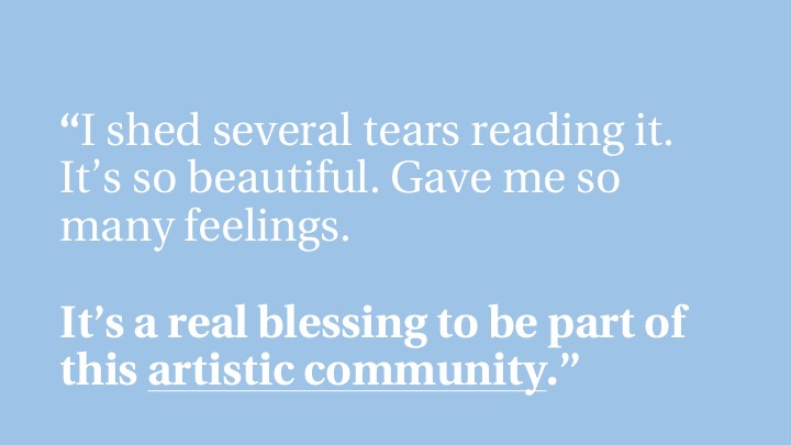
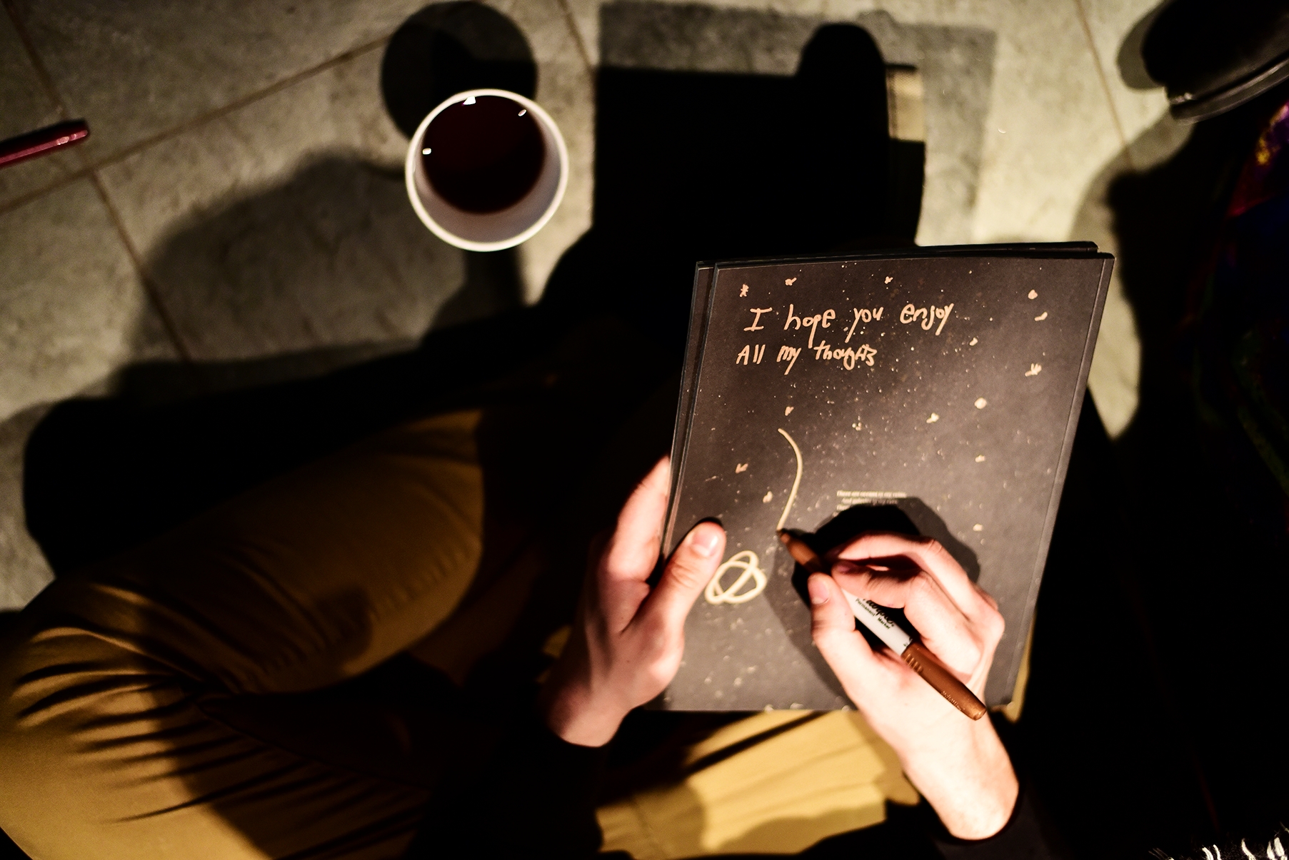
Despite the value of numerical data, I take more pride in the qualitative feedback we received throughout the year. Below is one of the most touching emails we unexpectedly received from a student on campus:
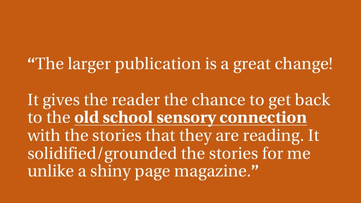
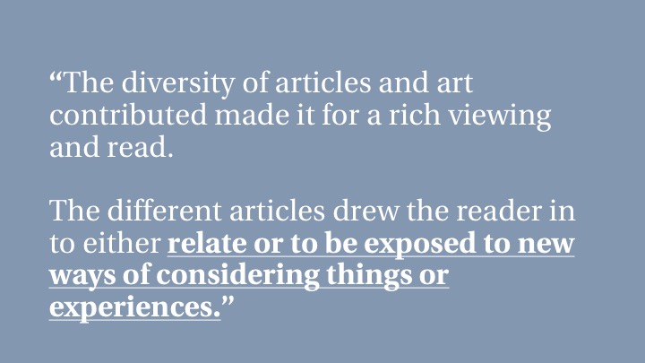
Below are several more comments we received shortly after our magazine relaunch: