

Case Study
30 Ingredients
a cookbook for Slow food and slow living
Project:
Graphic & Communication DeSign, Leeds University
Brief:
Re-design the cookbook of british chef, sally clarke
Art Direction
Branding
Graphic DesigN
Typography
Photography
Laser-cutting
Sally Clarke is a British chef who operates a restaurant, Clarke’s, in London. Its daily "set menu" is determined by what ingredients are in season and available at the markets in the morning. Such a concept comes from Clarke’s philosophy of cooking only with ingredients that are in season. Her cooking style can thus be described as simple, straightforward and natural, with space for additions or small changes to recipes if necessary. Clarke herself is also a quiet person—someone who prefers to simply do the work rather than talk about it, and someone who doesn’t mind getting their hands dirty..
Clarke’s cooking philosophy is aligned with the notions of slow food and sustainability—truly understanding where our food comes from, as well as supporting local farmers and producers.
The major design idea for this brief is slow design, an idea that hailed from the concept of Slow Food—a global, grassroots organization founded by founded by Carlo Petrini in 1989. Its major goal is to “prevent the disappearance of local food cultures and traditions, counteract the rise of fast life and combat people’s dwindling interest in the food they eat, where it comes from and how our food choices affect the world around us.” One particular element of slow food is the idea that food is tied to many other aspects of life, such as culture, politics, agriculture and the environment.
To visually communicate this idea, the overarching visual motif consists of horizontal lines that connect one side of the book to another, with various elements in between. This motif is drawn from the roads and freeways in maps, which connect different places and bring attention to the movement of food before it gets to our plates. The book is oriented in A4 landscape format to match this; the goal is for the viewer to move slowly across the page as one would at a particular landscape. The connection between food and places is a major idea of the book. Thus, many elements are drawn from the visual style of old English maps, such as the typography, textures, colour scheme, line styles and some small icons.


Covers & Table of Contents
Focusing on when ingredients are in season
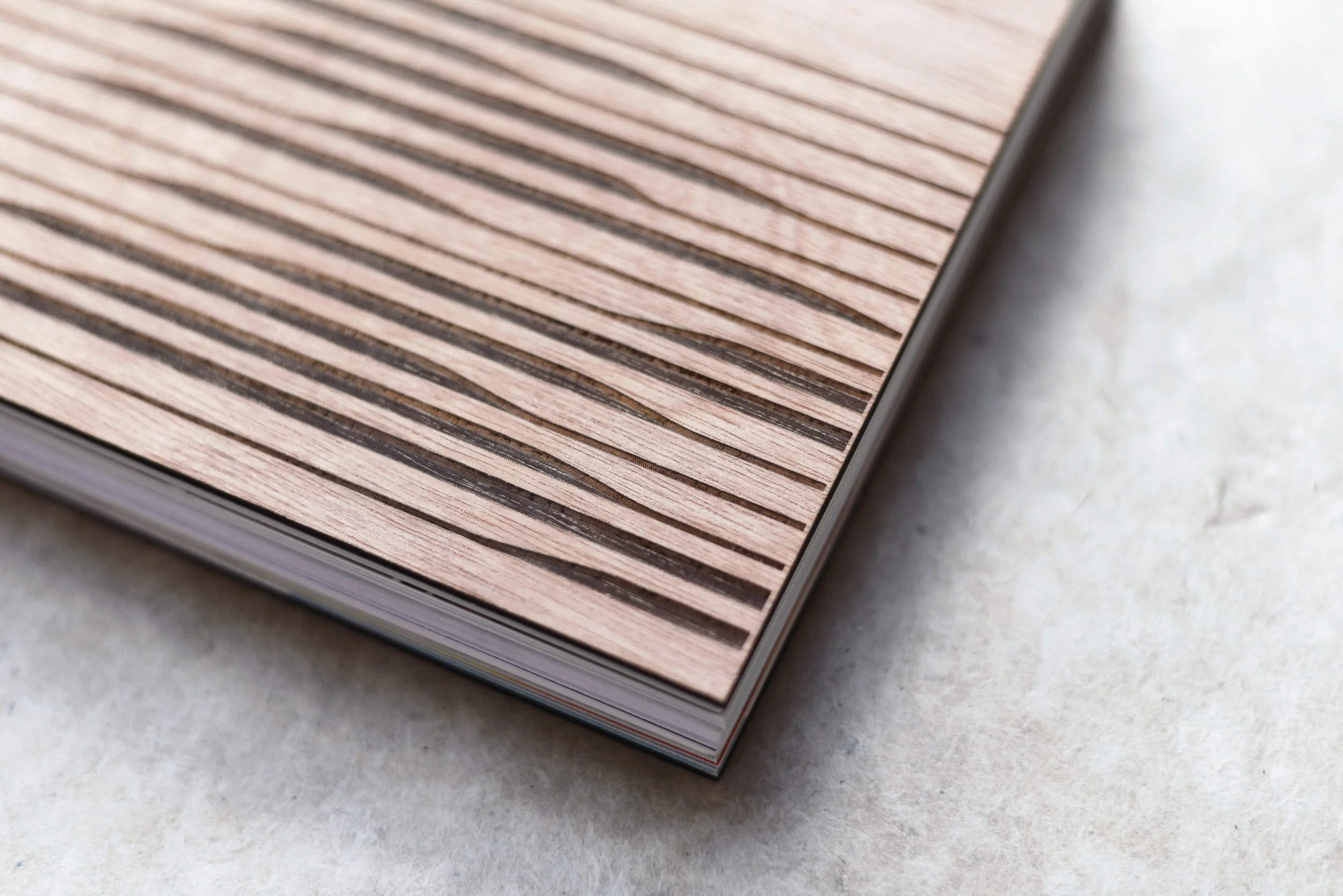
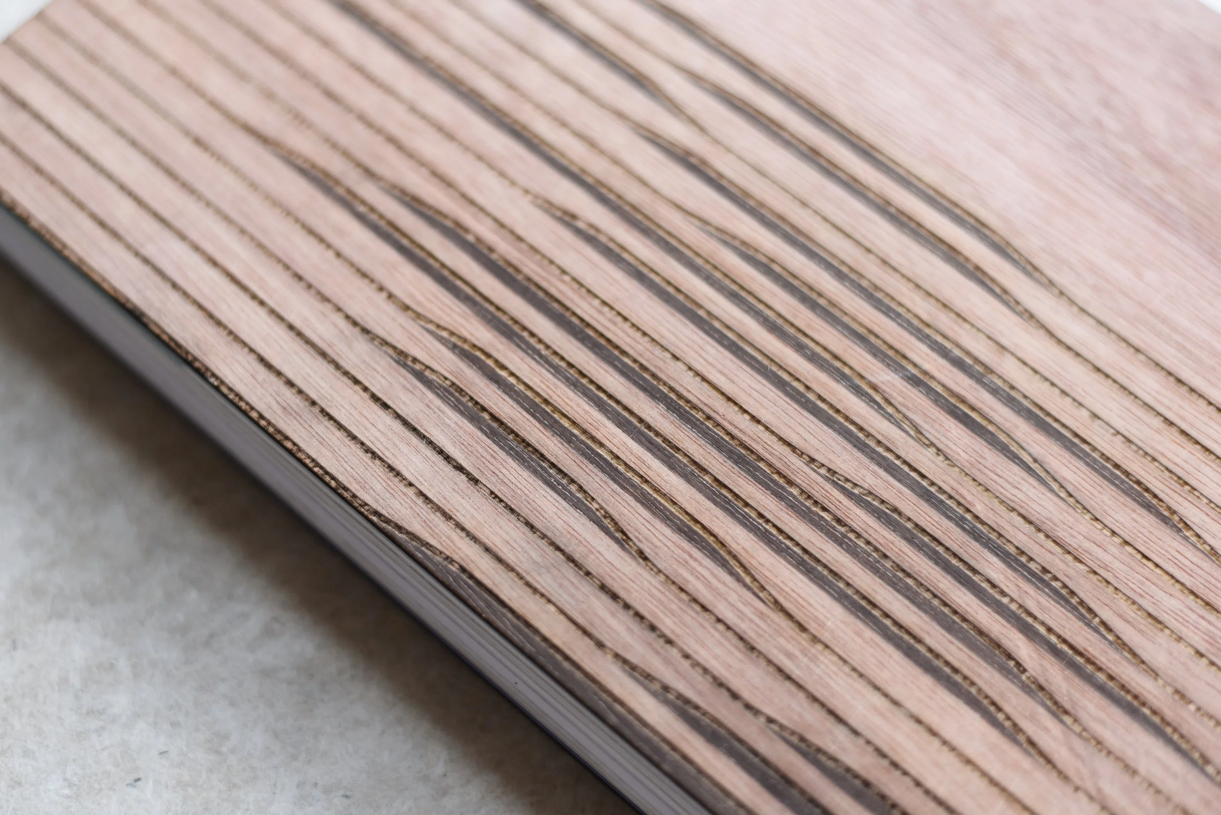
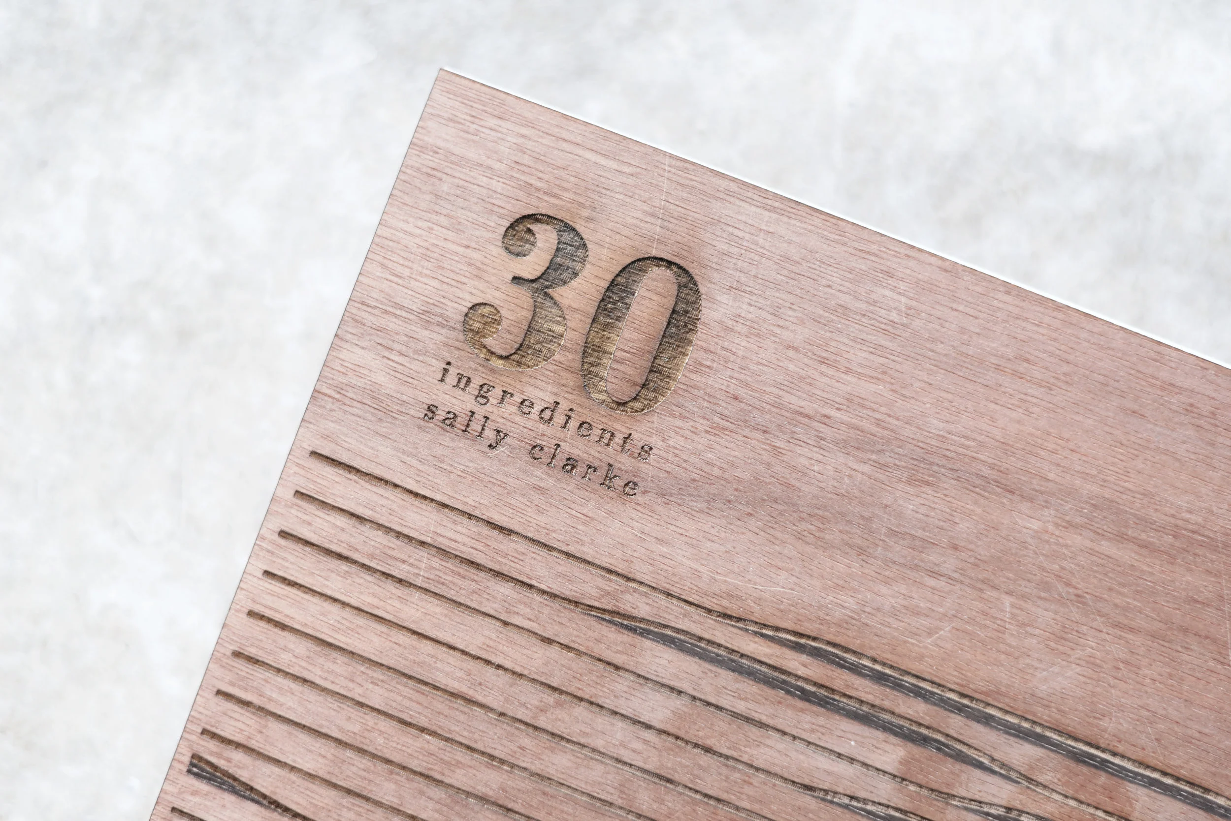
A timeline was created for every ingredient to show the months in which the ingredient would be in season. After being layered on top of each other, a captivating image of landscapes (or even waves of the ocean) emerged from the pattern. This image thus symbolizes the connections between our food, the seasons of our life, and the places they come from and go to throughout its lifetime. The Table of Contents outlines when each ingredient is at its best, so cookbook readers know when to buy specific ingredients before following the corresponding page numbers to find its associated recipes.
This seasonality graph is laser-cut into salvaged wood to make up the front and back covers of the book. Using salvaged wood essentially means that no two covers will be the exact same. This is an important concept in slow design, as the focus is shifted away from mass production and complete conformity, and is placed towards organic elements that come from nature. Things such as scratches or dents, on a normal book cover, would damage its visual style; however, on these wooden covers, they would only make them more authentic.
Slow Design consists of six principles which work together to counteract a “fast” lifestyle: reveal, expand, reflect, engage, participate and evolve.
It encourages consumers to literally slow down and pay attention to the details of a specific design, and reflect upon them. To achieve this goal, simplicity is required, but also a high attention to detail. For instance, page numbers are scarce to encourage readers to slowly flip through the book to find the page they are looking for. Layouts and typography are straightforward, traditional, and simple. Throughout the cookbook, there are many negative spaces for viewers to sit and pause and reflect on what they’ve read. A sense of quiet and calmness is also achieved through such spaces, which is fruitful for readers to browse through the cookbook mindfully.
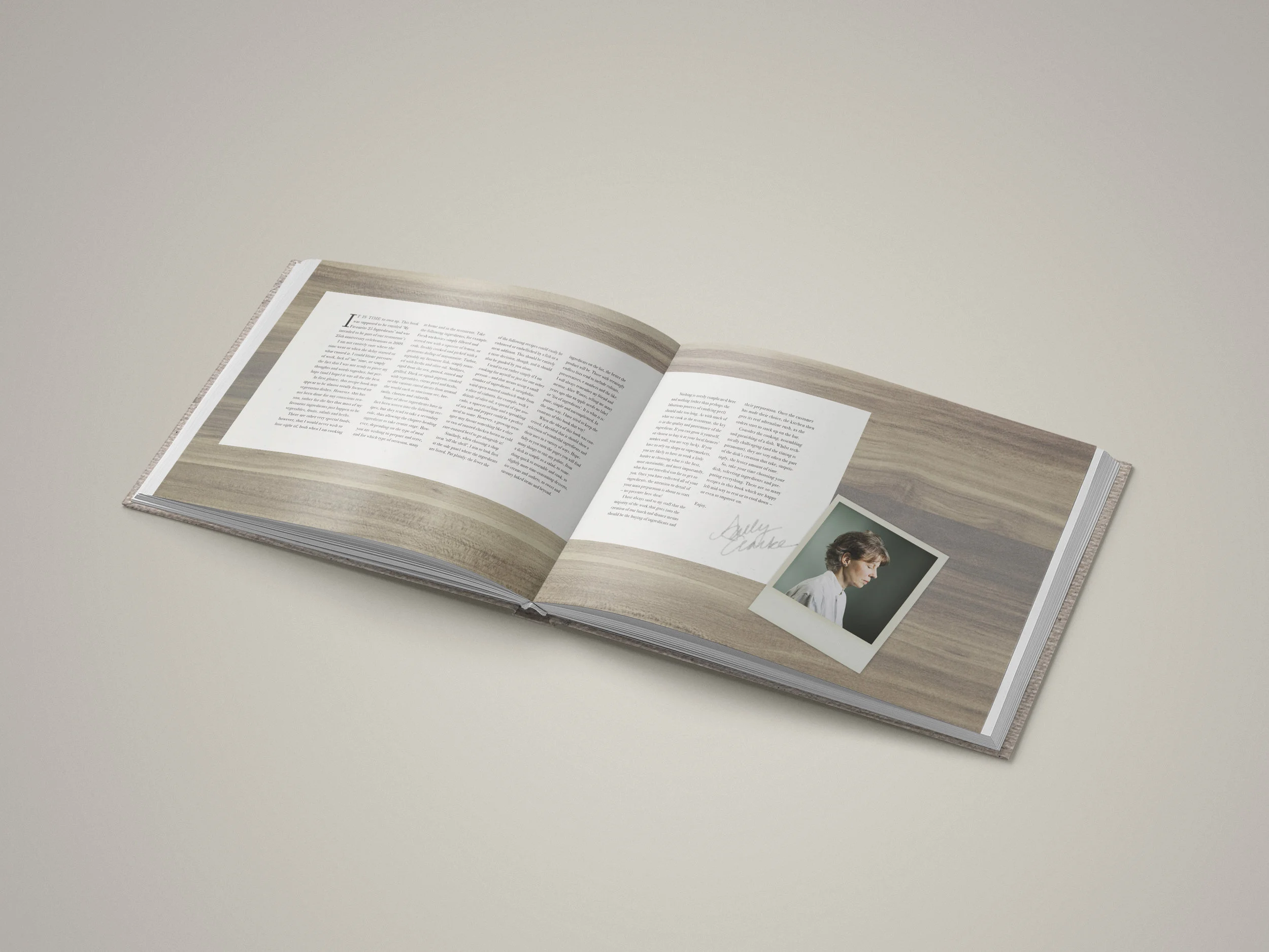
Introduction spread, with a personal letter from Sally Clarke herself.
Endpapers
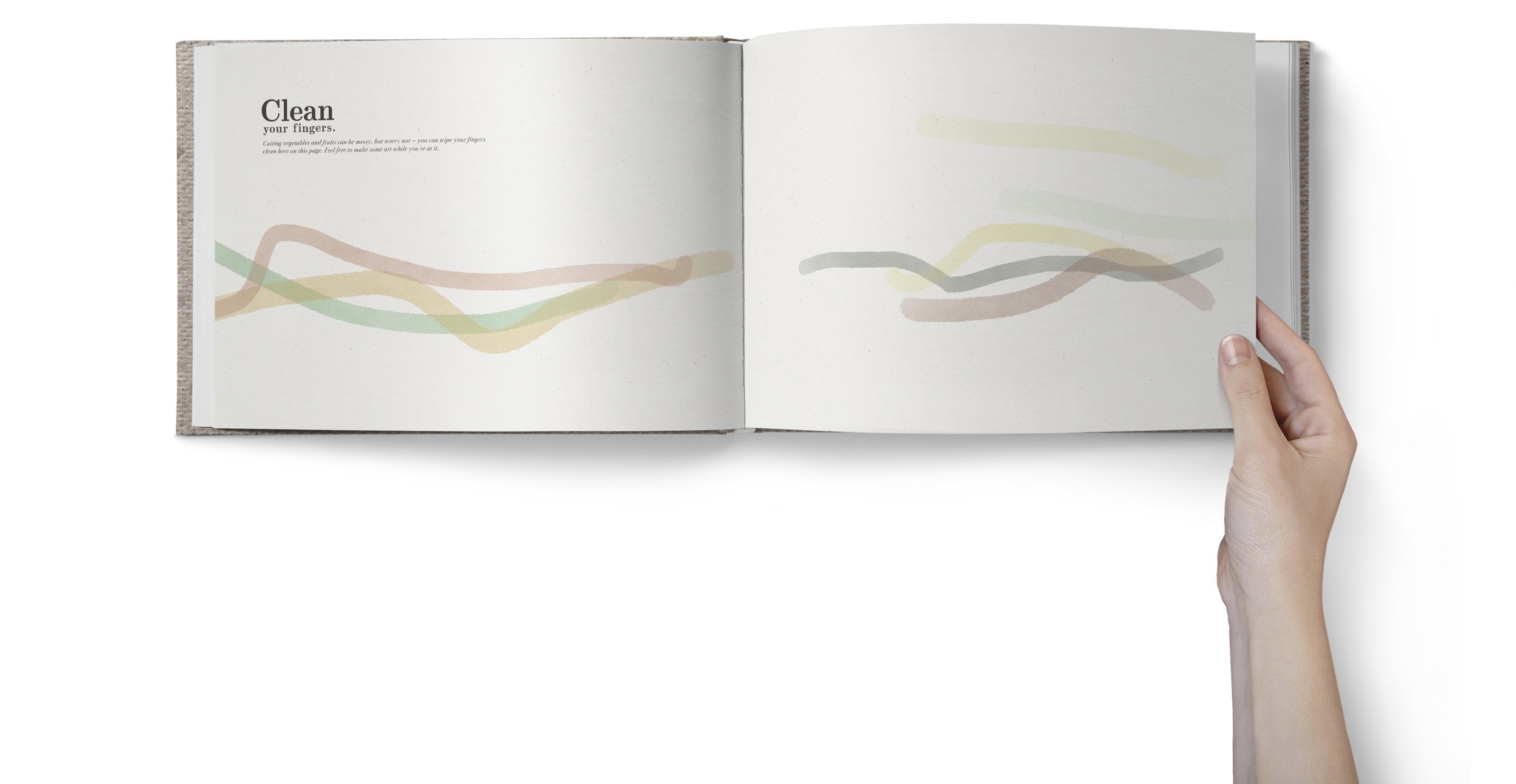
An artistic way to clean your fingers
Why not let the reader create their own endpapers? One problem that cookbook users face is that their fingers become dirty from handling certain ingredients. For instance, cutting specific fruits and vegetables (such as berries) can leave one’s fingers covered in its juices. This makes it hard to flip through pages in the cookbook as it dirties the pages.
The solution for this is using the endpapers (a heavy watercolour paper, 300-600gsm) as a place for users to clean their fingers on. At the same time, this acts as a canvas for them to create art on as they are waiting for things to cool or bake, for example. This element of engaging the user of the book allows them to personalize their book in a way that also symbolizes the recipes they have cooked from the book. By dragging one’s finger(s) across the endpapers, the visual motif of horizontal lines is continued to bookend the inner pages.
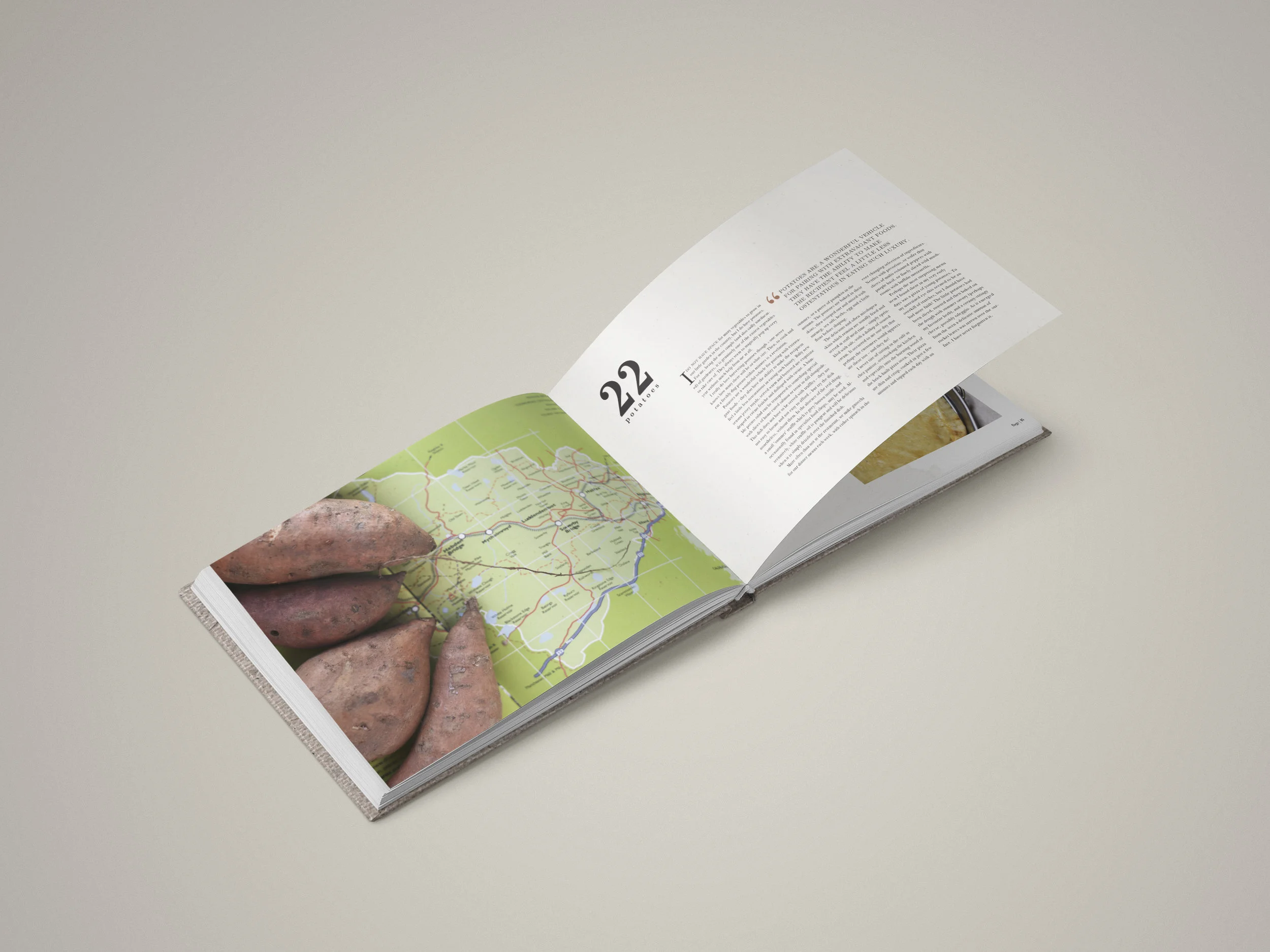
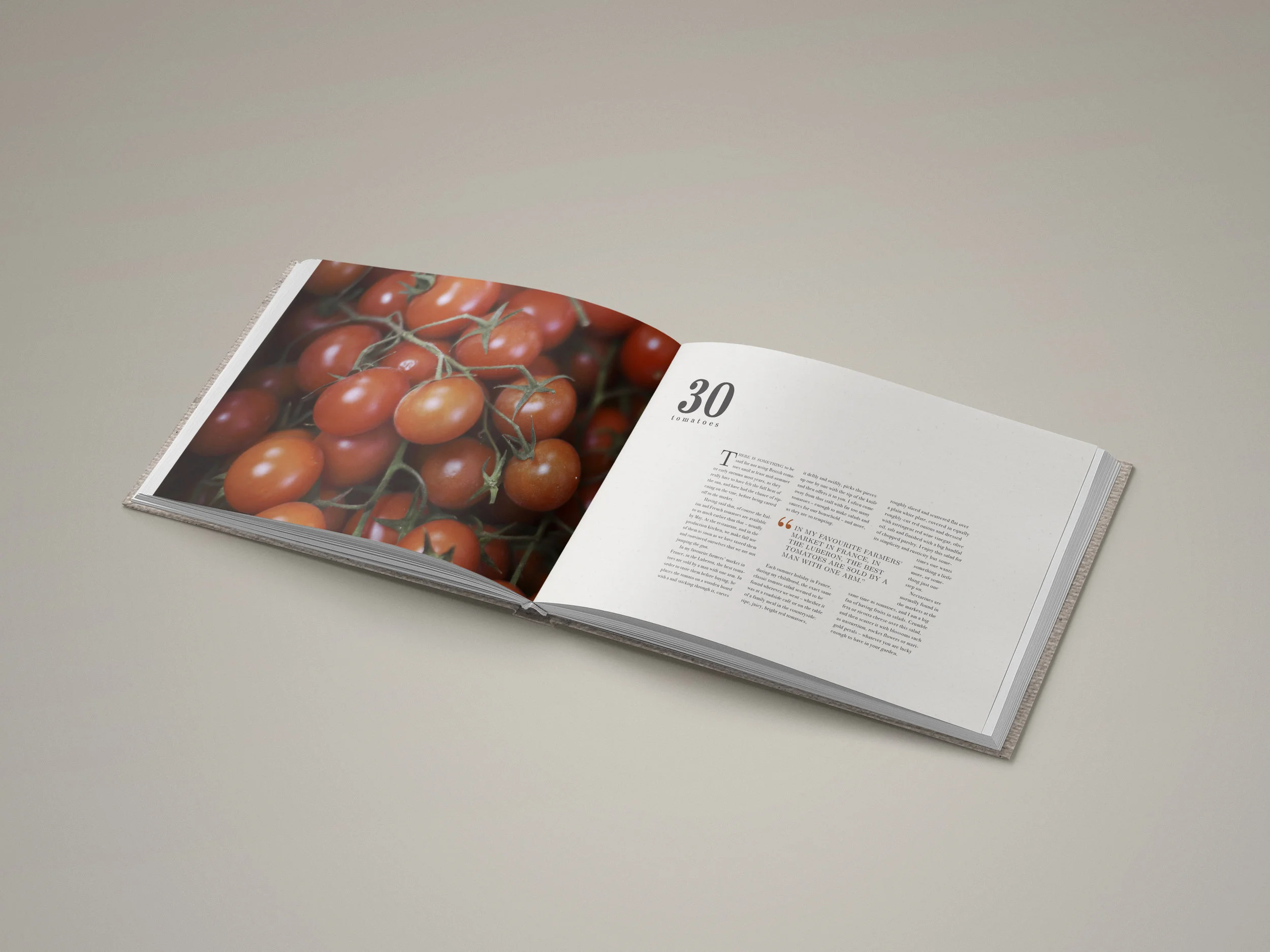
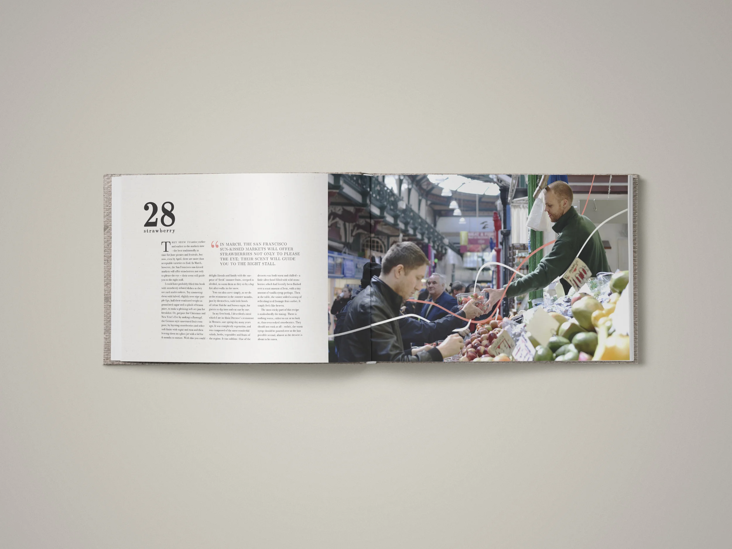
Ingredient Pages
Spotlighting each ingredient as chapter dividers
These spreads act as chapter dividers, as each spotlights a different ingredient. Ingredients are thoughtfully photographed in a way that captures the essence and motif of connecting lines, tying the entire book together.
Logos for each ingredient, in the same style as the title of the book on the front cover, are placed in the same position on the page—a way of keeping continuity and coherency, as well as simplicity. The two-digit number indicates which ingredient it is on the list of Clarke’s 30 ingredients. Pull quotes are also added on several ingredient pages for more dynamism in the layout, with the colour of the opening quotation mark always the same as the colour of the ingredient.

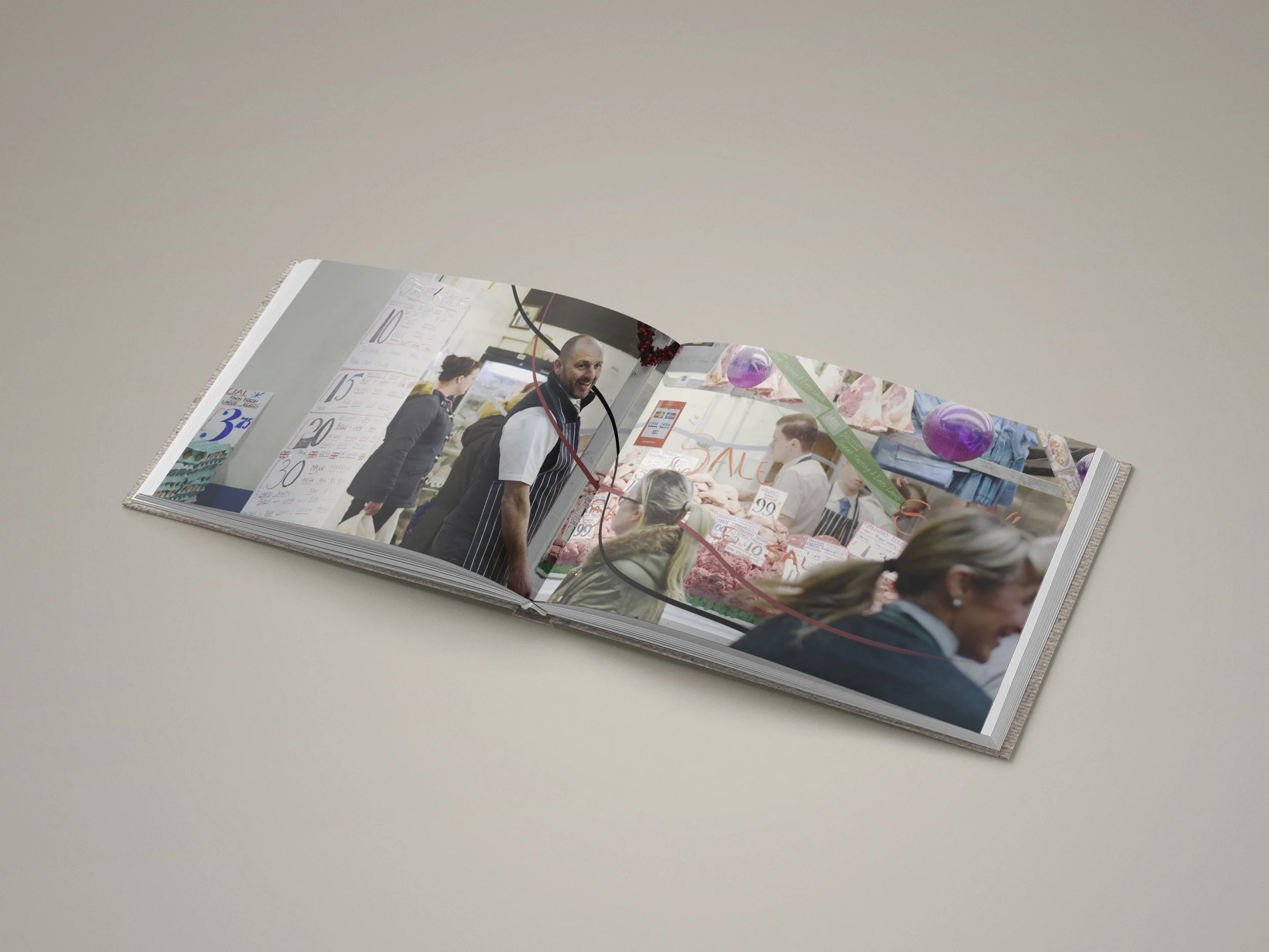
Environmental Portraits
Putting the people back in cooking
Environmental portraits are extremely important in this cookbook. Following Clarke’s philosophy of food, what we eat is highly connected to the people who have played a role in getting the food to the plate. Thus, photographs of food producers at local markets contribute to this human element of the cookbook.
One major problem with many cookbooks is that most are completely devoid of any human elements as they attempt to focus on the food produced and make those look as attractive as possible.
However, our food is not created in a vacuum; there are many factors to food production that have to do with people, places and politics. By including a fair amount of environmental portraits of real vendors at markets, an honest human element to cooking is brought to light. The motif of horizontal connecting lines continue physically through these market scenes, showing the important connection between food, the people they come from, and the people they go to.
Recipe Pages
An innovative way to follow recipes
The recipe pages are perhaps some of the most unconventional but crucial parts of the cookbook. One goal for these pages was to discover a new way to present a recipe without using blocks of paragraphs of text, but instead, allowing a reader to travel across a vast landscape from one side of a spread to the other.
After all, cooking is not an activity that is compact and done in a blocky and compressed manner; following a recipe takes time and space from beginning to end, as well as a lot of breathing room in between steps. Thus, following the principles of slow design, recipes are turned into timelines, with steps labelled from left to right on spreads.

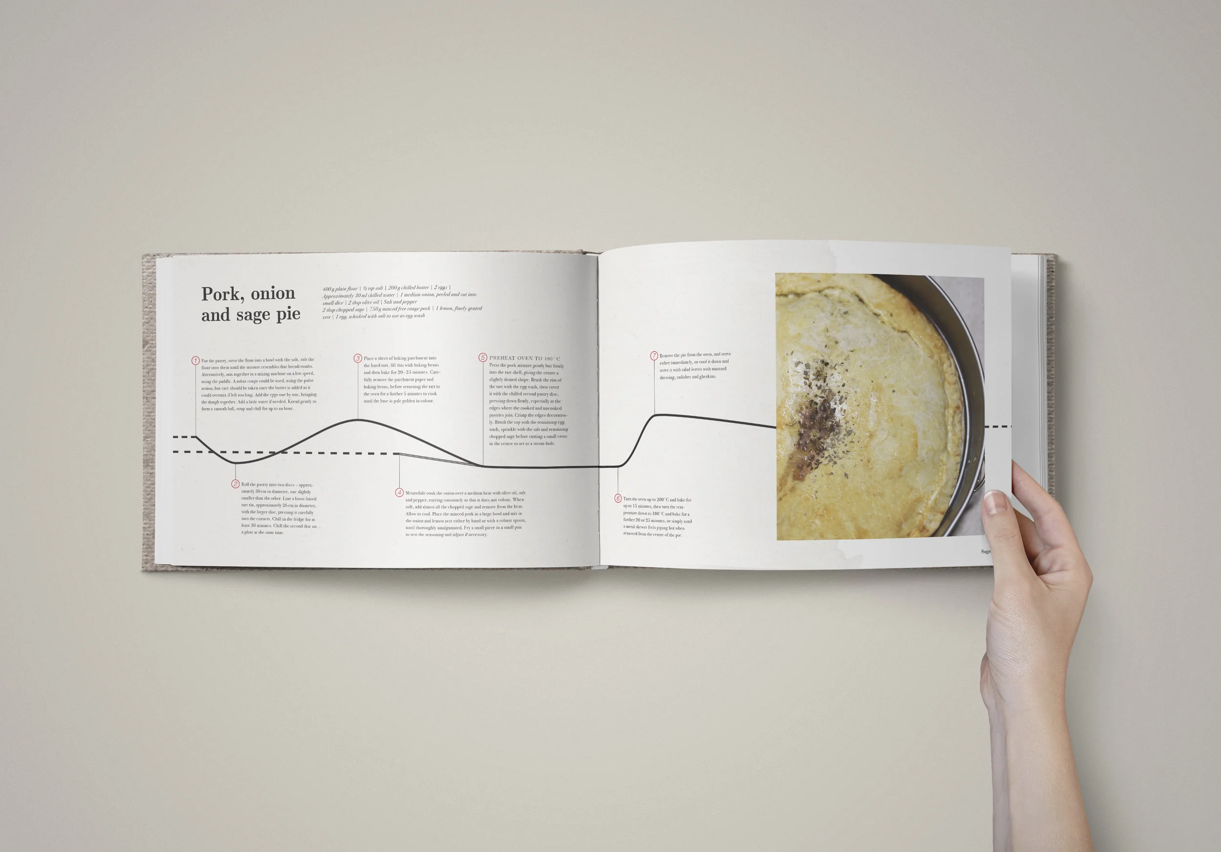

Recipe pages can also be adapted to and viewed on the landscape modes of mobile devices.